lemmytellyousomething@lemmy.dbzer0.com to Privacy@lemmy.mlEnglish · 2 years agoEU forced LinkedIn to allow me a selectionlemmy.dbzer0.comimagemessage-square9linkfedilinkarrow-up1170arrow-down17file-text
arrow-up1163arrow-down1imageEU forced LinkedIn to allow me a selectionlemmy.dbzer0.comlemmytellyousomething@lemmy.dbzer0.com to Privacy@lemmy.mlEnglish · 2 years agomessage-square9linkfedilinkfile-text
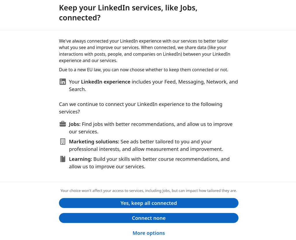
minus-squarexilliah@beehaw.orglinkfedilinkarrow-up2·2 years agoYes but the other two services are desirable, so I almost clicked accept all. Also the consent button feels like it has a more attractive text than the reject button.
minus-squarexilliah@beehaw.orglinkfedilinkarrow-up3·2 years agoAt the end of the gray sentence it says it impacts how tailored the service is. It’s something that would be valuable to me in this case. They should’ve shown a happy kitten instead.

deleted by creator
Yes but the other two services are desirable, so I almost clicked accept all. Also the consent button feels like it has a more attractive text than the reject button.
deleted by creator
At the end of the gray sentence it says it impacts how tailored the service is. It’s something that would be valuable to me in this case.
They should’ve shown a happy kitten instead.