
I wanted to share a small project I’ve been working on. The goal was to make the data from NASA’s Landsat Thermal Infrared Sensor more accessible to the general public.
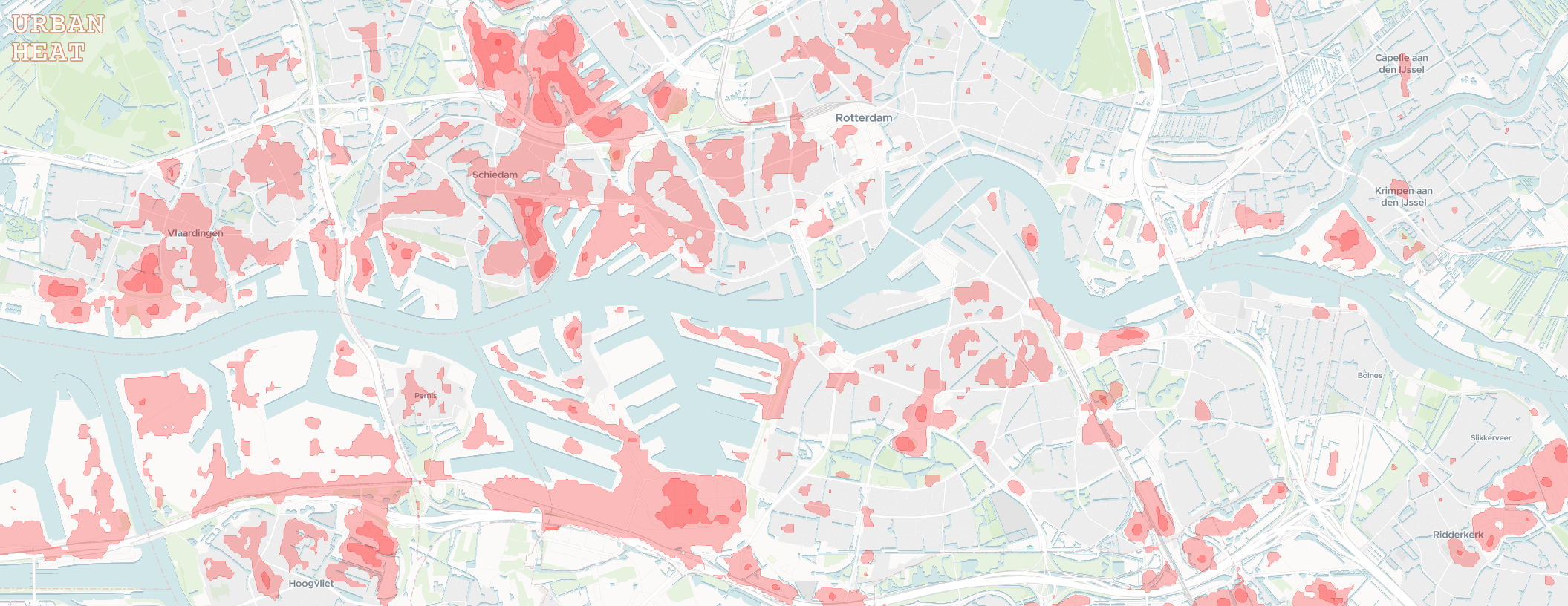
I worked with the raw temperature band data to general annual maximum surface temperature raster images for large urban areas covered by the Eurostat GISCO Urban Audit. In the browser, these images are transformed into easier to interpret isotherm contours with some adjustable settings.
I don’t have a specific target audience in mind. The map could help identify areas of refuge for the warmer months, or overheated neighborhoods to avoid as we march towards a toasty future.
Feedback is welcome :)
EDIT: For UK visitors, sorry to leave you with an empty map…
I’ve taken a look at older urban extent data and found the geometry I need to process the UK (from before leaving Eurostat). However, there are still some UI limitations to overcome since it seems that cities are split into many boroughs that could only be viewed one at a time. The reason I went with the Eurostat dataset to begin with was a nice delineation of what a city was (for the purposes of this project).
Don’t have a timeline, but I do want to add the UK and automatic loading of cities as you pan!
Yes, only European cities covered by Eurostat. I tried to cover this in the about section but it basically boils down to processing time, my own available time and to a lesser extent storage.
It took me more than a week to process 2013-2023 for the included areas, which is roughly 10TB of raw imagery (with less than 60% cloud cover).
The Eurostat urban extents, for the most part, delineate urban areas with a detailed vector dataset. This is something that I also couldn’t find on a global scale.
I’m not decided yet on expanding the extents, which also depends on if people actually find this useful. However, it is open source (AGPL) so it can easily be forked and adapted.