

New GNOME dialog on the right:

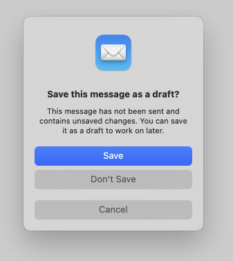
Apple’s dialog:
They say GNOME isn’t a copy of macOS but with time it has been getting really close. I don’t think this is a bad thing however they should just admit it and then put some real effort into cloning macOS instead of the crap they’re making right now.
Here’s the thing: Apple’s design you’ll find that they carefully included an extra margin between the “Don’t Save” and “Cancel” buttons. This avoid accidental clicks on the wrong button so that people don’t lose their work when they just want to click “Cancel”.
So much for the GNOME, vision and their expert usability team :P
I’ve submitted a fair share of UX in-depth analysis with examples and links to literature on the GNOME team blog and they tend to ignore / comment dismissingly and then remove my comments after a few weeks.
Ahahaha
Judging from your post and replies, you look very aggressive, rude and demanding so no wonder the devs deleted your comments.
To be fair, he could also just be fed up after a long time being ignored for what he thinks is quite an important design decision.
May be but some of this user’s post history is a bit questionable.
In-depth analysis ≠ random ramblings on lemmy.