

New GNOME dialog on the right:

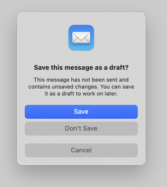
Apple’s dialog:
They say GNOME isn’t a copy of macOS but with time it has been getting really close. I don’t think this is a bad thing however they should just admit it and then put some real effort into cloning macOS instead of the crap they’re making right now.
Here’s the thing: Apple’s design you’ll find that they carefully included an extra margin between the “Don’t Save” and “Cancel” buttons. This avoid accidental clicks on the wrong button so that people don’t lose their work when they just want to click “Cancel”.
So much for the GNOME, vision and their expert usability team :P
I started on gnome. I love it at first, but as time has gone on my experience with gnome had gotten worse and worse, and my KDE experience keeps getting better. It’s a real shame because I actually tend to prefer the gnome look at feel, but KDE has been so much more usable for me in recent years.
It’s very easy to get a Gnome look and feel with Plasma nowadays.
I still don’t know why Gnome loves wasting 3 % of the screen on an empty black bar, tho.
Yeah ngl I don’t get using the entire space fore almost nothing. I use a few extensions to fill it up and make it more useful
That is true. But I have an overall better experience getting KDE to look like gnome.
That’s what I said.
Lol that is what you said. My bad. Must have read it wrong. That’s on me.
I’m kind of on the same boat you’re… however KDE tends to have issues with visual proportions and margins everywhere.