
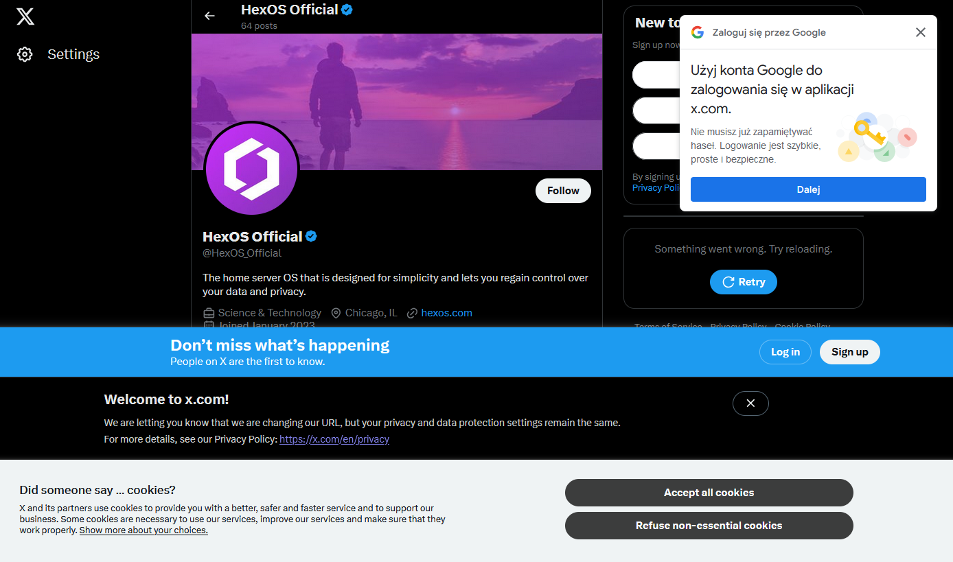
I happened to click a link that took me to the associated twitter X account for something I was interested in and was greeted by not one, not two, but four modern day web popups.
I know it’s nothing new. I’ve got a couple of firefox plugins that are usually quite good at hiding this sort of nonsense, but I guess they failed me today (or, I shudder to think, there were even more that were blocked, and this is what got through)
What’s the worst new/not-signed-in user experience you’ve encountered recently?
I don’t know, but I also don’t know why would anyone willingly choose this UX for their website.
Writing sign-in and authentication can be difficult. Google handles it for you. They’ll also store all of the secret stuff that you don’t want to leak, like passwords, etc. So I can see some of the appeal for sites of a certain size, but not really Twitter.
I can understand that, and a user can also enjoy the simplicity of the process. However, I’m speaking about this very popup here. It doesn’t have to be this way. There are plenty of websites that allow you to sign in/up with Google (or another 3rd-party provider) that don’t have this problem. I see so many websites and mobile apps that make it very difficult to use them. I always wonder if anyone at the company is using their own website/app. Reddit is another great example.
Oh right, yeah, it really irritates me. I’m sure it comes from some Growth Team experiment where the only success metric was interactions (intentional or accidental) with the box.
Making the box increased engagement with the box, ship it!