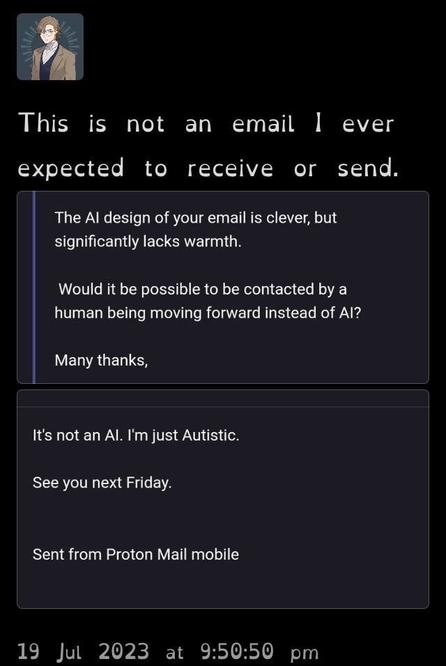
@[email protected]M to Don’t You Know Who I [email protected] • edit-21 year agoDon’t you know I’m not AI?lemmy.worldimagemessage-square96fedilinkarrow-up11.17Karrow-down115
arrow-up11.16Karrow-down1imageDon’t you know I’m not AI?lemmy.world@[email protected]M to Don’t You Know Who I [email protected] • edit-21 year agomessage-square96fedilink
minus-square@[email protected]linkfedilinkEnglish0•1 year ago Those look very different from each other to me.
minus-square@[email protected]linkfedilinkEnglish6•1 year agoIt’s decent, but i find leaving out serifs on capital I to be very silly for a font that wants to be legible. I’m trying atkinson hyperlegible now and it makes good use of the serifs.

Those look very different from each other to me.
It’s decent, but i find leaving out serifs on capital I to be very silly for a font that wants to be legible.
I’m trying atkinson hyperlegible now and it makes good use of the serifs.