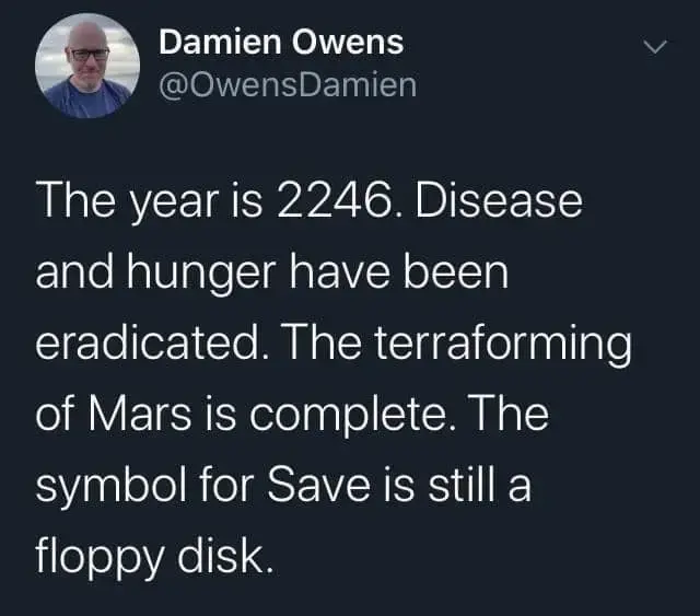
Not confusion, evolution. If people keep using the floppy disk icon to mean “portable small amount of data”, the definition and icon for the same code point can easily get updated to reflect the generalized meaning and new media.
Arguably, the specification should not be for a “floppy disk” or “minidisk” or “DVD” or specific kind of storage media in the first place, they should’ve been for “portable storage media” and let everyone draw what’s more fit for their demographic.
Google’s hairy heart, because nobody read the spec and the artist just copied what they saw in the picture
That isn’t what happened, and rather more of an example of what I was talking about.
“Yellow heart” is a medical condition that makes the heart look “hairy”, “hairy heart” is referenced throughout history as associated with bravery and is still a saying in Portuguese; at the same time, “green heart” was represented as a sort of “sweaty” (envious) heart; “blue heart” was… a weird thing, but at least they made it blue color.
Instead of “[color] heart”, someone designed them as “idiomatic meaning of [color heart]”, interpreting the Unicode descriptions as idiomatic expressions.
This is the same process that could morph a “floppy disk” into a “small capacity portable data storage device” that could get depicted in any number of ways.
Unicode isn’t designed to contain abstract concepts.
I’d argue that all the emotion faces are “abstract concepts” 🌞😎🌝🕶️😇
I’ve have never heard of “yellow heart” as a medical condition and I can’t find any references about it online either, neither in English or Portuguese. Maybe you can link me?
I think the misinterpretation makes the most sense:
Especially considering that none of the other emoji are even trying to do any kind of idiomatic interpretation of their description.
Then again, Android 4 just put random heart related shit in all the heart emoji space so maybe there really was an artist that decided to go off the rails and draw some weird hearts. Either way, they’ve been corrected now. Whatever experiment Google did with their emoji set, it’s now over; there is some room for interpretation, but not so much that it deviates strongly from every other emoji design.
While the shape of the character can vary significantly, designers should maintain the same “core” shape, based on the shapes used mostly commonly in industry practice. For example, a U+1F36F HONEY POT encodes for a pictorial representation of a pot of honey, not for some semantic like “sweet”. It would be unexpected to represent U+1F36F HONEY POT as a sugar cube, for example. Deviating too far from that core shape can cause interoperability problems: see accidentally-sending-friends-a-hairy-heart-emoji.
Direction (whether a person or object faces to the right or left, up or down) should also be maintained where possible, because a change in direction can change the meaning: when sending 🐊 🔫👮 “crocodile shot by police”, people expect any recipient to see the pistol pointing in the same direction as when they composed it. Similarly, the U+1F6B6 pedestrian should face to the left 🚶, not to the right. See Section 2.10, Emoji Glyph Facing Direction.
Uremic pericarditis, which causes fibrinous pericarditis, presents as a yellow heart with hair-like stuff. The sources are pathology books (check Google Books) and autopsy photos (some are on Google Images, kind of NSFW). It used to be associated with “heroic death”. Then “Coração Peludo” got several meanings, so I can imagine someone familiar with those and looking for references of “yellow heart”, might’ve found examples of “hairy heart” and drawn just that.
I’m guessing they tasked a single person with adding the emojis (how hard is it to draw some simple colored shapes, right?), and didn’t have anyone review them. They probably were also told not to look at examples from competitors, in case they copied them too closely and got sued for copyright infringement.
As for Unicode… it’s a shame person figures can be made of “group type {shape [+ skin tone] [+ gender] [+ hair color]}*n”, but they didn’t use general color modifiers for the basic shapes. 🐈⬛
I always get a little bit annoyed with emoji because they had the opportunity to become an interesting pictographic language. But because of various insistences on them representing things rather than concepts we’ve sort of got stuck and the floppy disk have to be floppy disk is an example of that.
What I mean is things that are difficult to convey in language. Like how we’ve had to resort to /s and italics and bold to convey emphasis. All the open box symbol that is used to indicate a space rather than just having a gap.
If you create a pictographic language and get others to use it, Unicode will include your characters. They included Chinese and other pictographic ways of writing, after all.
I don’t think pictographic language is that great. Every picture has cultural associations (just look at the associations with 🍆, 🍑, or 🥺). If you would like to communicate through pictographic symbols representing concepts, there’s a wide range of them that over a billion people use every day, and that is (almost) entirely included in Unicode already.
Chinese is of course not a pictographic language it’s an alphabet like western alphabets.
We kind of have pictograms in Unicode already like ☢️ or ⚠️ or ⚡ which are universal even though they don’t really represent physical objects.
The radiation icon particular doesn’t really make any kind of logical sense, radiation is in non-visual threat so there’s no reason it should look like that, over anything else, and yet everyone knows that’s what the symbol means. It’s not a picture of something, it’s the picture of a concept.
Equally there’s no real reason that warning should be a triangle and electricity definitely doesn’t look like that. Again though we kind of don’t even think about it we just know what the symbols mean. With Chinese you actually have to learn the language like you have to learn english or you have to learn Italian.


deleted by creator
Not confusion, evolution. If people keep using the floppy disk icon to mean “portable small amount of data”, the definition and icon for the same code point can easily get updated to reflect the generalized meaning and new media.
Arguably, the specification should not be for a “floppy disk” or “minidisk” or “DVD” or specific kind of storage media in the first place, they should’ve been for “portable storage media” and let everyone draw what’s more fit for their demographic.
deleted by creator
That isn’t what happened, and rather more of an example of what I was talking about.
“Yellow heart” is a medical condition that makes the heart look “hairy”, “hairy heart” is referenced throughout history as associated with bravery and is still a saying in Portuguese; at the same time, “green heart” was represented as a sort of “sweaty” (envious) heart; “blue heart” was… a weird thing, but at least they made it blue color.
Instead of “[color] heart”, someone designed them as “idiomatic meaning of [color heart]”, interpreting the Unicode descriptions as idiomatic expressions.
This is the same process that could morph a “floppy disk” into a “small capacity portable data storage device” that could get depicted in any number of ways.
I’d argue that all the emotion faces are “abstract concepts” 🌞😎🌝🕶️😇
I’ve have never heard of “yellow heart” as a medical condition and I can’t find any references about it online either, neither in English or Portuguese. Maybe you can link me?
I think the misinterpretation makes the most sense:
Especially considering that none of the other emoji are even trying to do any kind of idiomatic interpretation of their description.
Then again, Android 4 just put random heart related shit in all the heart emoji space so maybe there really was an artist that decided to go off the rails and draw some weird hearts. Either way, they’ve been corrected now. Whatever experiment Google did with their emoji set, it’s now over; there is some room for interpretation, but not so much that it deviates strongly from every other emoji design.
To quote the unicode committee:
Uremic pericarditis, which causes fibrinous pericarditis, presents as a yellow heart with hair-like stuff. The sources are pathology books (check Google Books) and autopsy photos (some are on Google Images, kind of NSFW). It used to be associated with “heroic death”. Then “Coração Peludo” got several meanings, so I can imagine someone familiar with those and looking for references of “yellow heart”, might’ve found examples of “hairy heart” and drawn just that.
I’m guessing they tasked a single person with adding the emojis (how hard is it to draw some simple colored shapes, right?), and didn’t have anyone review them. They probably were also told not to look at examples from competitors, in case they copied them too closely and got sued for copyright infringement.
As for Unicode… it’s a shame person figures can be made of “group type {shape [+ skin tone] [+ gender] [+ hair color]}*n”, but they didn’t use general color modifiers for the basic shapes. 🐈⬛
I always get a little bit annoyed with emoji because they had the opportunity to become an interesting pictographic language. But because of various insistences on them representing things rather than concepts we’ve sort of got stuck and the floppy disk have to be floppy disk is an example of that.
What I mean is things that are difficult to convey in language. Like how we’ve had to resort to /s and italics and bold to convey emphasis. All the open box symbol that is used to indicate a space rather than just having a gap.
If you create a pictographic language and get others to use it, Unicode will include your characters. They included Chinese and other pictographic ways of writing, after all.
I don’t think pictographic language is that great. Every picture has cultural associations (just look at the associations with 🍆, 🍑, or 🥺). If you would like to communicate through pictographic symbols representing concepts, there’s a wide range of them that over a billion people use every day, and that is (almost) entirely included in Unicode already.
Chinese is of course not a pictographic language it’s an alphabet like western alphabets.
We kind of have pictograms in Unicode already like ☢️ or ⚠️ or ⚡ which are universal even though they don’t really represent physical objects.
The radiation icon particular doesn’t really make any kind of logical sense, radiation is in non-visual threat so there’s no reason it should look like that, over anything else, and yet everyone knows that’s what the symbol means. It’s not a picture of something, it’s the picture of a concept.
Equally there’s no real reason that warning should be a triangle and electricity definitely doesn’t look like that. Again though we kind of don’t even think about it we just know what the symbols mean. With Chinese you actually have to learn the language like you have to learn english or you have to learn Italian.