- cross-posted to:
- [email protected]
- cross-posted to:
- [email protected]
Hey everyone! Ill be starting to share updates on the frontend visuals here like I was doing with Pangora before it got merged into Sublinks
- Edit: note for people who are wandering in here not knowing what Sublinks is. Sublinks is an upcoming fediverse link aggregator separate from lemmy. It will have api compatibility on release so frontends and apps should still work but the project will be focusing a lot on mod tools and federation updates once it reaches parity. This UI is the default frontend I’m designing for it
Starting off with some progress I’ve been making on the Home Page. Been taking things I enjoy from both alternate frontends such as Photon and Tesseract, as well as Misskey forks like Iceshrimp and Sharkey.
People who followed me as I was developing Pangora might recognize a lot of similar design decisions
Still in progress but ill try to share new progress at least every couple of days when I work on it with new additions
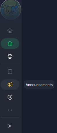
The left sidebar can be collapsed to show only icons for people who want a bit more space for post cards

Hovering over an option adds a popover saying what it is

In addition when you scroll down the navbar shrinks a bit to give you more space for post cards. On mobile the navbar hides completely when you scroll down and then shows again when you scroll up
The frontend is still heavily in progress so things may change a lot still before release as I refine it. If you’ve got suggestions feel free to give me them


Thanks! Yeah lot of design is an amalgation of things I liked from many different frontends
Photon, voyager, alexandrite, tesseract, iceshrimp, sharkey
Really liked how you structured site info so did something similar but added in some similar formatting from pangora so it has things like the banner at the top