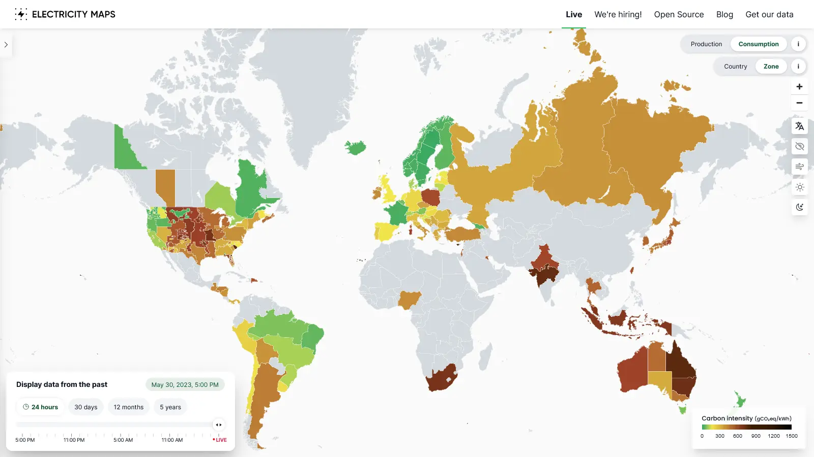
Nice tool to get an idea of different electricity markets.
I’m curious where they get their data. Their info for my area doesn’t match the fuel mix report from my public utility.
Edit: looks like data sources are linked on their GitHub.
Their info for my area doesn’t match the fuel mix report from my public utility.
Same here. https://www.nem-watch.info/widgets/reneweconomy/ for Australia conflicts significantly in terms of fuel mix with the electricitymaps data.
EDIT: Possibly it’s not exactly “live” and has a lag time of a few hours, at least going by the time written in the bottom left. Then the data is likely closer to correct.
It’s a few hours behind and they have obviously problems with behind the meter production. Adfitionally, the values for CO2 emisdions are off (i.e. nuclear is calculated with 5g/kWh, this is 1/3 to 1/10 of the values you find in literature) But all in all, you can see the trends of production and im- export.
behind the meter production
Makes sense as Australia has the highest rooftop solar uptake in the world, and Queensland, the state I looked at, has IIRC the highest uptake within Australia. But agreed, it’s good to see global data even if it’s currently imperfect.
Unfortunately not as comprehensive as I would have liked. It has data on barely half the world, and almost none on Asia and Africa.
This is not accurate, we have coal power in Sweden as well, but not at large scale, also they try to cover it as burning olive seeds, but that is just some percent of the coal they are burning.
EDIT: seems like they closed the last coal powerplant in 2020.
deleted by creator
Denmark-based ElectricityMaps.com joins Spain, Norway, and Ireland in recognizing a Palestinian State :)


