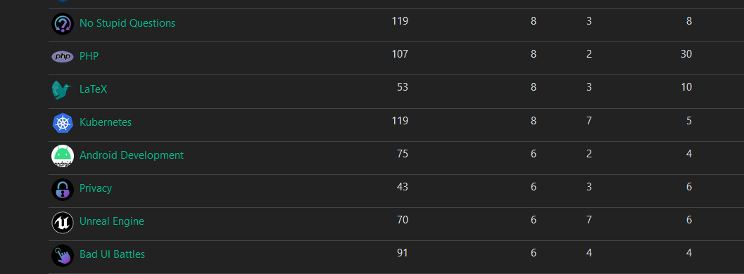
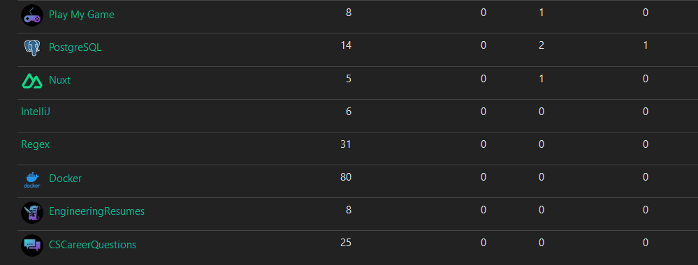
Ive been working on some unified icons for the instance so the icons feel like they belong together
Let me know if you like them or if there’s some adjustments I should make
Some examples from ones I’ve done


The majority of them are generated from https://game-icons.net/ with the settings of foreground being shrunk twice and position being x:2 y:2. Foreground color is diagonal from 2EE5D2 to A01FC5. And has a shadow with color 423025 and blur set to 15. The background color is just black


Alright yeah that one looks great
There isnt technically icon guidelines yet until the icon poll in this post finishes https://programming.dev/post/190520
Once thats done ill be switching the communities like meta, programming, and the new ones over to whatever style wins