

You must log in or register to comment.
are there any communities for bad graphs ? :))
//edit: changed their to there
Are there any communities for misuse of their/there/they’re? /lh
Their must be one. Plz create they.
*Their must bee won
Nope, that’s BoneAppleTea.
I thought someone would of created it by now.
Too busy making would’ve /would of communities
I’ll take commune titties for 500.
c/dataisugly
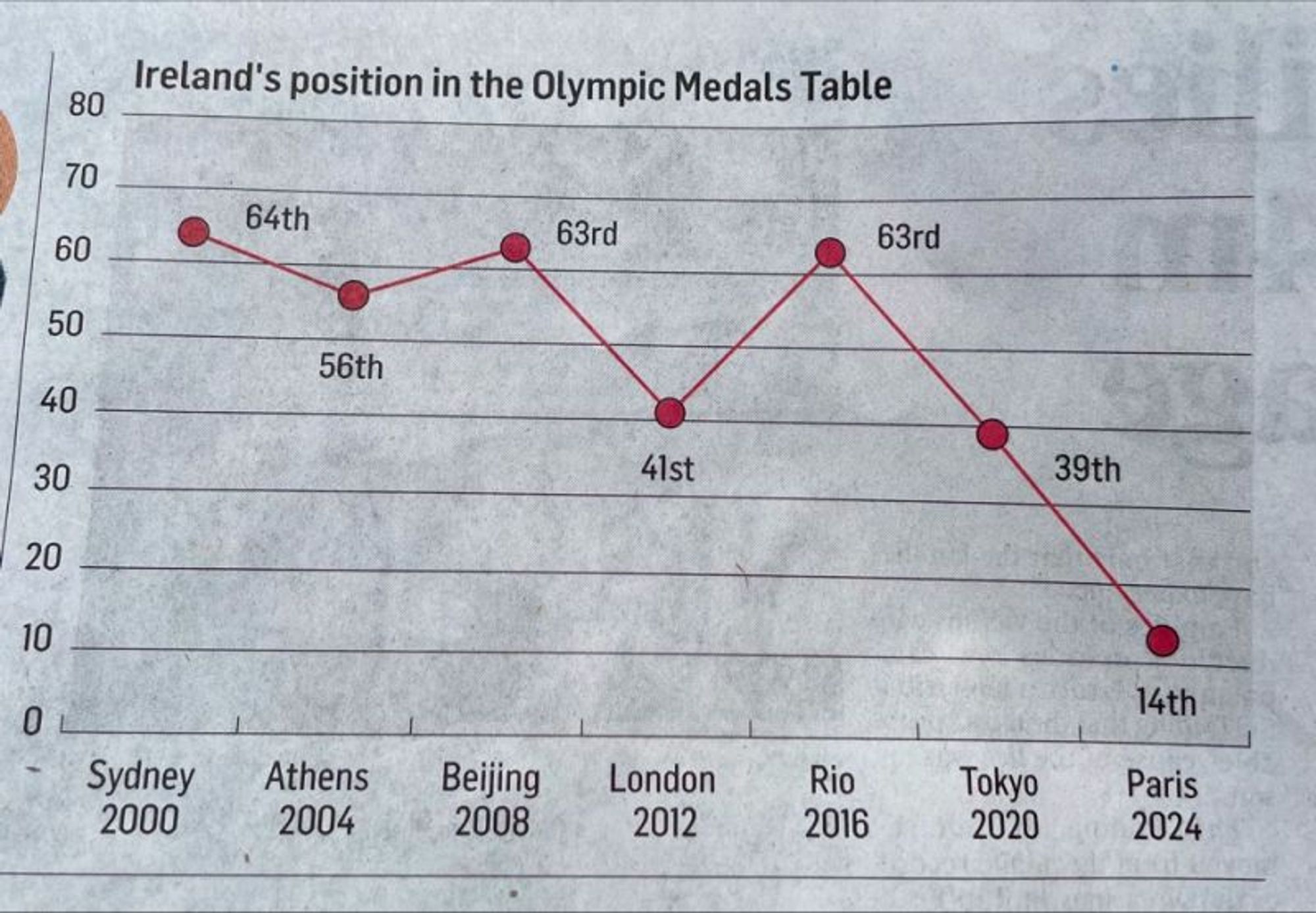
At this rate in 2028 they’ll be at -11th
I like how the position axis starts at 0, maybe that’s for a year they don’t qualify
If the article is about how just a few countries are dominating the podiums, I think this is an incredibly effective graph.
The values are even incorrect. 2008, they got 63rd. 2024 they got 19th.
…does it not say 63rd for 2008?
Yeah it does. I fucked up, they actually placed 64th and not 63rd. Importantly I’m not a reporter.
This reminds me of that chart showing gun deaths over a few years that showed the line going down the more deaths there were. That made sense graphically, they colored it in to look like blood dripping down, but this is just dumb.
At this rate, at the next Olympics they’ll be in -10.5 place!
WE’RE NUMBER ZERO! WE’RE NUMBER ZERO!
The Y axis is the absolute number of medals and the labels for each data point are relative rankings. If one country got all the medals except one and Ireland got that one remaining medal, there would be a data point at Y=1 with the label “2nd”.
That theory might work if the data point labels didn’t directly correspond with the Y axis labels.
Yeah but it’s not. At all.
They’ve beent taking single digit medals.
My nose is bleeding 😪
Tbh I don’t see where this is bad (except maybe the 0 label). Why should “up” always be “better”? There are countless other examples where this is not the case. Or am I missing something here?
It measures place, rather than performance (like medals got). It’s a line graph, when there’s no events between the data points, so it should be a bar graph. And yeah, up is better.
A bar chart for this kind of data makes no sense to me as the bar doesn’t really represent anything. A scatter plot is a good choice and adding a connection line for readability is imo not so bad. It should however be inverted going up to 1 and not down to 0.
Line chart is fine here as it’s the same measure over time.


