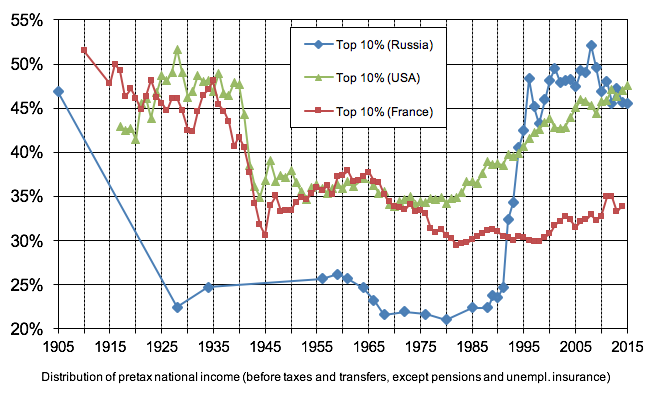
Late 1991, but yep, that’s when inequality skyrocketed, as it was illegally disbanded and the former state sliced up and sold for parts to the highest bidder against the wishes of the public at large, causing roughly 7 million deaths.
Left column isn’t labelled, no source is provided, Russian points on the graph are sparse when compared to the USA and France lines, there’s no heading explaining what the graph says. Please do better.
I’m usually quite particular about labelling axes, but this graph has both axes partially labled, and while the dates are easily inferred, the meaning of the left axis is in the footer, as is the general explanation.
Explain this graph:
Also wasn’t 1995 when the USSR collapsed?
Late 1991, but yep, that’s when inequality skyrocketed, as it was illegally disbanded and the former state sliced up and sold for parts to the highest bidder against the wishes of the public at large, causing roughly 7 million deaths.
Left column isn’t labelled, no source is provided, Russian points on the graph are sparse when compared to the USA and France lines, there’s no heading explaining what the graph says. Please do better.
I’m assuming you’ll actually answer now that the full source is linked, correct? Or are you just incapable of facing reality?
For images that don’t list the source in themselves like these I like to put the source in the alt text like this
Oh, nice! Thanks!
I’m usually quite particular about labelling axes, but this graph has both axes partially labled, and while the dates are easily inferred, the meaning of the left axis is in the footer, as is the general explanation.