It’s pretty easy to spot dark patterns when you look out for them, but I found a pretty obvious example of this.
Stoofie is a brand that sells water fountains for your pet (I don’t know what the problem with a water bowl is, but I digress). WayBack Machine
Plastered at the top of their website is “33% OFF Ends Today- Free Shipping” with no way to dismiss it. There is a scrolling text under the main image “FAST AND FREE SHIPPING 60-DAY FREE RETURNS”
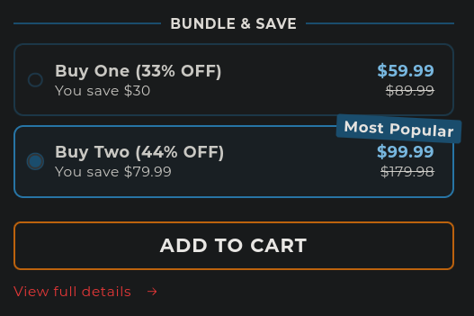
If you scroll down, you’re immediately introduced with a product with the option to buy two preselected. The rest of this section explains itself:

Other things are sprinkled in the main page, but it really is the prime example of dark patterns. I am personally sick of finding them, but would love to see more examples of what others have found. Please, share your favorite examples of dark patterns. Don’t forget to archive them first so they can never be lived down.


Most cookie consent dialogues:
Most companies are trying to actively manipulate you to accept all cookies, but nowadays there are a few companies that don’t resort to any of these dirty tricks.
The one that scares me the most is:
Accept all or Settings
And you have to opt out 5-10 buttons and at the end there is a “save settings” or the “accept all” button again in green.
Who has time for this shit? Just for a stupid article? We need laws against these.
With a heading “We care about your privacy”.
🙄
Oh they care. They care a lot. Particularly that you don’t have any so they can sell all your details to any bidder.
They care about it so much that they probably have a full time UI designer whose job is to figure out new ways to trick and manipulate users to hand out even more data.
Pretty sure EU law says that the buttons should be identical
Exactly. It should be as easy to decline all cookies as it is to accept. And user’s consent can’t be implicit.
I wish it was legal to ddos the sites that violate this law.
Oh I remember those thoroughly cursed menus where you have to manually disable 256 cookies one by one. Haven’t seen those in a while though, so I guess some piece of legislation is doing its job.
That’s actually a nightmare
Who has time for this shit? Just for a stupid article?Won’t using reader mode ( if your browser supports it ) help you avoid this ? or those browser add-ons like " I don’t care about cookies "
I’m honestly surprised no-one has built an extension to automatically opt out of them, or at least the major cookie providers interfaces.
I realise there are many extensions which outright block cookies, etc; I’m meaning specifically the annoying dialogues you describe
In ublock origin settings. There is an “annoyances” group with options. It should take care of most of those popups.
https://addons.mozilla.org/en-US/firefox/addon/consent-o-matic/
Aarhus university has done exactly that! https://consentomatic.au.dk/
It doesn’t work 100% of the time but it’s pretty good
You forgot a million switches for each “partner”. More like prostitution.
Based on the number of partners some companies seem to have, they are far more promiscuous than most humans.
Yeah, EU fixed that somewhat, it has to be privacy-by-default now, the save choice being pre-selected and obvious and etc. But most dialogues are now illegal; no legal entity complains, nobody fixes it.
Site has cookie consent dialogue?
immediately leave site (Most Popular)
That’s what my mother does because she’s senile.
Having the dialogue is a good thing.
AFAIK this uses UX design rules
Stupidly enough, that’s illegal in the places this ruling is from. What’s going on there?