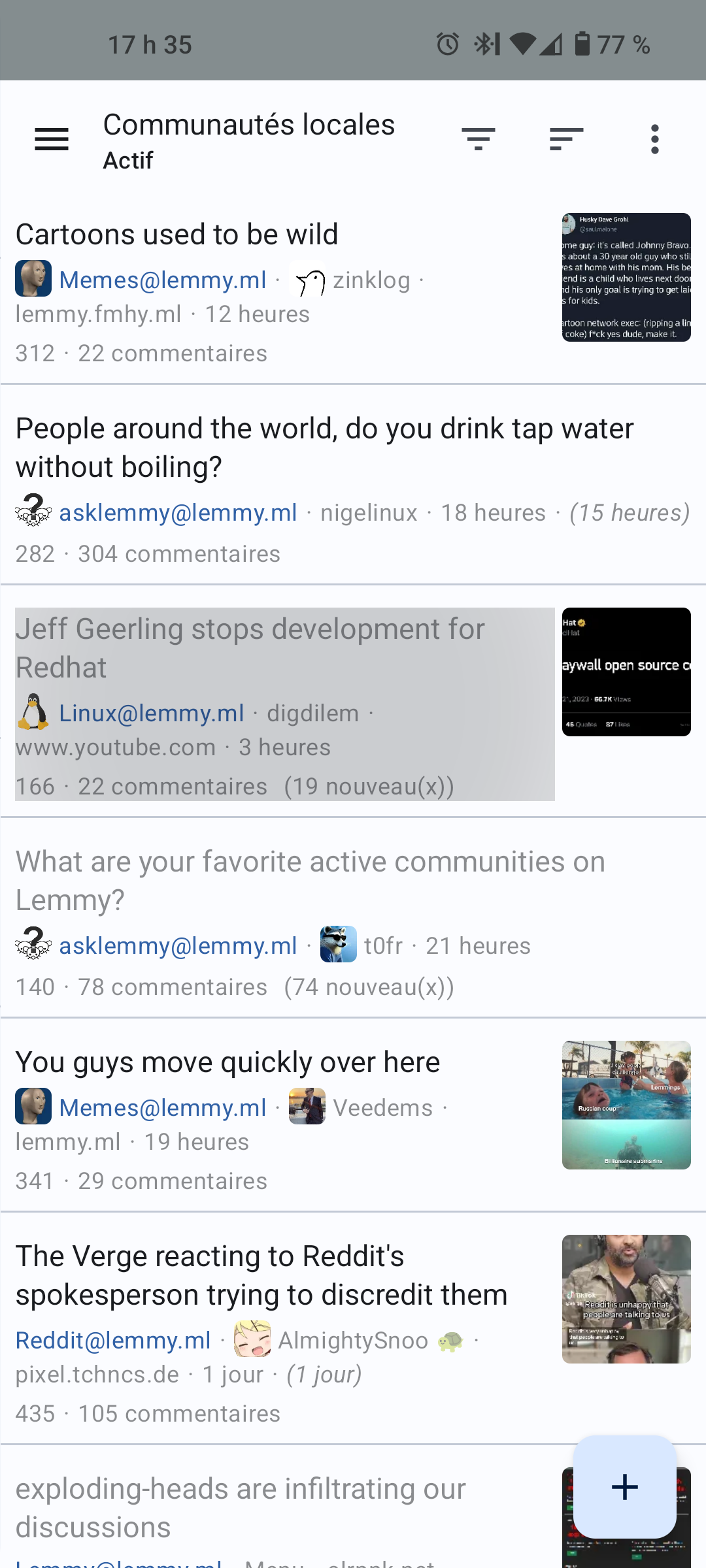
Either make the zones for those two options smaller or hide the options in a secondary menu. Thanks.
I submitted a pull request to fix this (for the list view) about a week ago and it was merged and released in version 0.0.36 today.
I recommend installing Jerboa via Droidify or Fdroid since the updates are immediate instead of having to go through Google’s week long review process
Bless you, I am so excited for that update!!
It wasn’t me. I have an airtight alibi. Hope you find the scoundrel.
Jerboa is still in very early development. It’s coming along nicely though, I think.
It’s better on “small card” instead of “list” view.
For me the whole row is the clickable area: see the grey zone as a tap and hold on a post:
You don’t use dark mode?
I have astigmatism and white on black text looks like this to me:
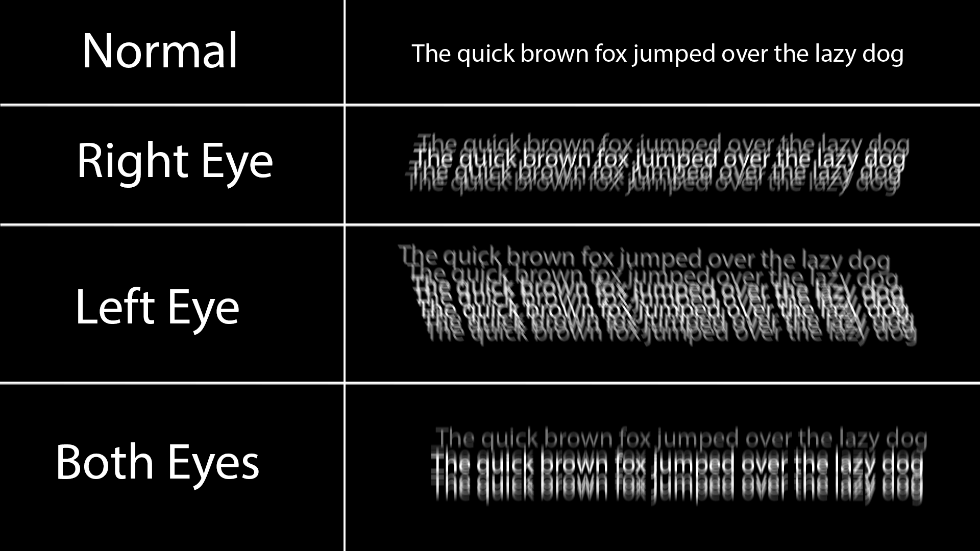
The ghosting is always light to dark, so black on white text ends up looking maybe a little grey on the edges but much more comfortable.
White on black also causes persistence issues with my eyes, after reading a lot of white on black I see horizontal lines when I look away or even just change position of the phone, making the ghosting even worse.
Dark mode looks much better, but causes issues with accessibility for some eye conditions. That’s why a good accessible application should always support light and dark and ideally respect system-wide settings.
That was an incredible diagram of what the text looks like for you.
f, i didn’t even know I had this! i too think dark mode looks nice but end up using light mode coz of eye strain.
Thank you for the information
Try to post it as featured request or issue on their GitHub.
No need, I already fixed it in version 0.0.36
It’s open source. Jump in there and fix it for us!
They may not have the knowledge to do this but feel their insight may be of help if others share the same issue
Already done. Install 0.0.36
Only short titles in list view need care. Longer titles are easy.
Offer a patch.