

I’m really digging the symmetric look and iconography of the new logo for programming.dev. Very creative yet pleasantly minimal!
What is the font or name of the typeface?
It’s Fira Code! I made the logo in like five minutes haha. @Ategon has been putting way more work into the other logos for the rest of the communities. I just spun this one up really quick. I think it can be modified a bit to make it better but just wanted to get something up real quick. I put the ofl license on the legal page since I’m pretty sure that’s required.
Those community icons are also on 🔥! They’re doing great at giving the server that extra polish.
Those are all thanks to @[email protected]! They did a fantastic job! I only contributed one, the [email protected] one lol.
It looks like Hack?
It’s Fira Code! I made the logo in like five minutes haha. @Ategon has been putting way more work into the other logos for the rest of the communities. I just spun this one up really quick. I think it can be modified a bit to make it better but just wanted to get something up real quick. I put the ofl license on the legal page since I’m pretty sure that’s required.
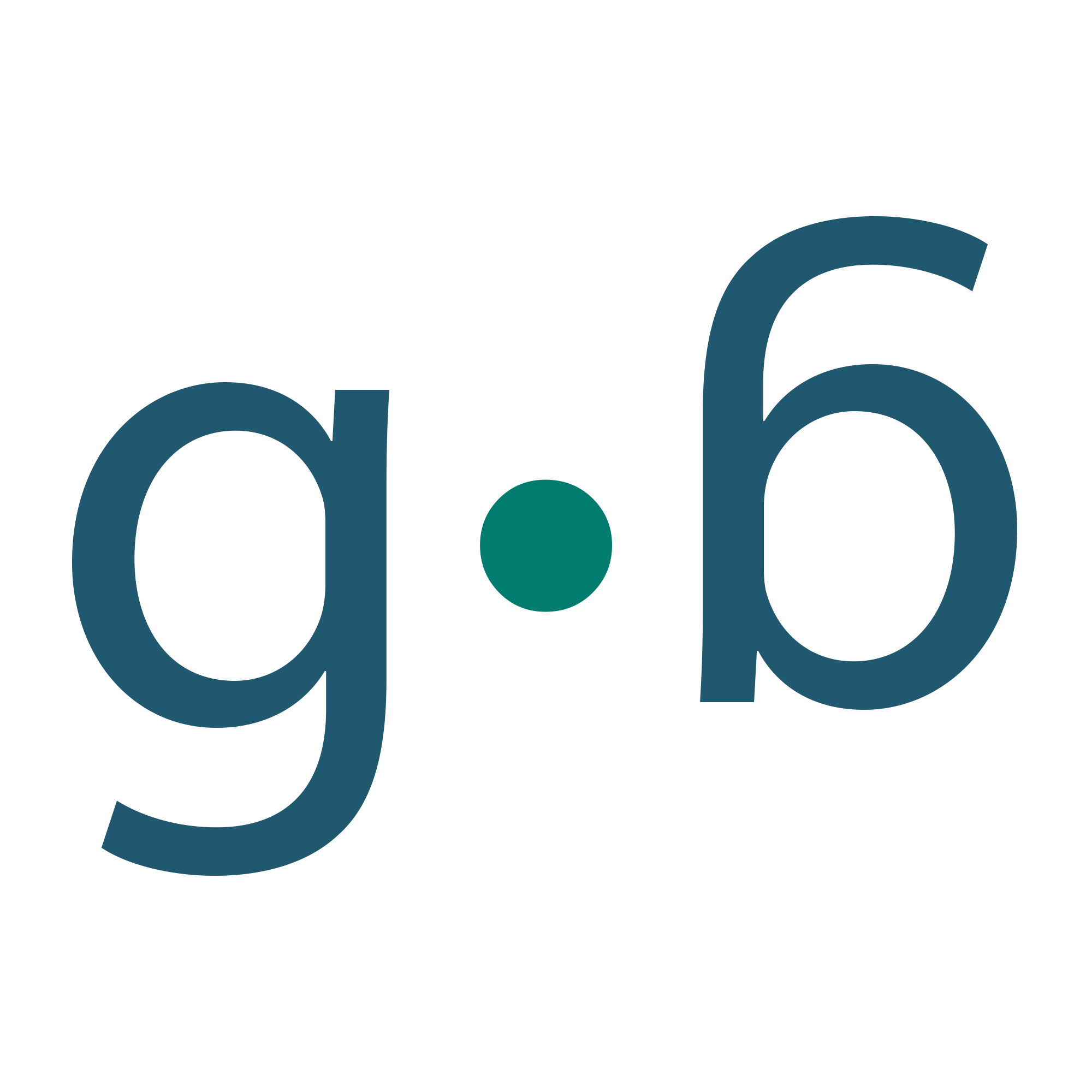
I agree, it looks awesome. I run /c/[email protected]. If anyone want to make me an icon in the style of this one (so, GB or gb or g.b. or whatever) or any style really, I’d appreciate it!
https://assets.adobe.com/id/urn:aaid:sc:US:e1af8345-d8c9-41e2-950c-ec2564c12381?view=published
you should be able to review the logo here. not sure if this will work though. says you’re supposed to do so without an account…
edit: actually I like this one more What do you think?

some others


@[email protected] , you rock! All of them are great, though I prefer the second one, since it has the rainbow in it! I will be saving all of them to a special folder though.
Thank you so much! You just made my day!
