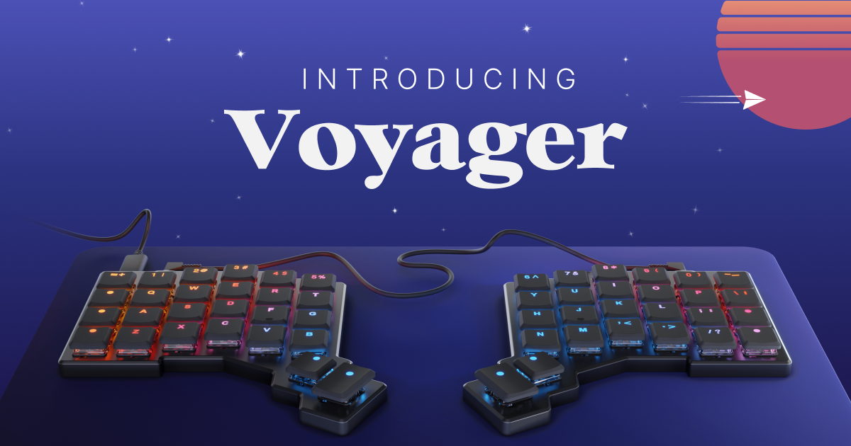
Looks great, but as a Corne fan, I would have loved to see another thumb key on each hand.
+1. I’ve standardized on 3 thumb keys per hand across all my keyboards.
Completely agree. I’m using Miryoku as default layout and the 3 thumb keys are a must for me.
Default Layout for those curious: https://configure.zsa.io/voyager/layouts/default/latest/0
If they ever force me to go back to the office, this will be my portable keyboard. The Moonlander is my keyboard for the home office, and can’t imagine going back to a standard keyboard. Wish my Moonlander keycaps had the symbols on number keys and +/- keys caps.
huh, wouldn’t have thought another lily/sofle-like makes sense to offer, but ig i’m too far removed from commercially available layouts to really have a reasonable intuition 😅
I wish ZSA would go a bit harder on pinky stagger. I have the moonoander and that’s my only complaint.
Oh boy that looks really nice. Though I’m way too attached to my Keychron Q10 Alice keyboard.
Looks nice. A good expensive low-pro for folks who want to go all in without much tinkering or soldering. The thumbs and mods are a little baffling though. If you’re going to include a number row, why not go full maximalist and add a few extra modifiers and make it a traditional 56/58 key layout like the Lily or Sofle? It might look different hands on, but that thumb also seems really far out.
I’m surprised they didn’t make it wireless.
The Moonlander (my first foray into ergo keyboards) landed on my doorstep the same day i got the email announcing this. My heart dropped thinking they made Moonlander 2.0 but thankfully it’s just different. I want some tenting and don’t need portable but it does look nice.
If only it had 10 more keys I would but instantly!
Function row?
By design it’s not there. This is replacing the Planck keyboard from their line up to be very minimal on keys, but embracing the split key and ergonomics of the ergodox and moonlander.
No, one more column.


