
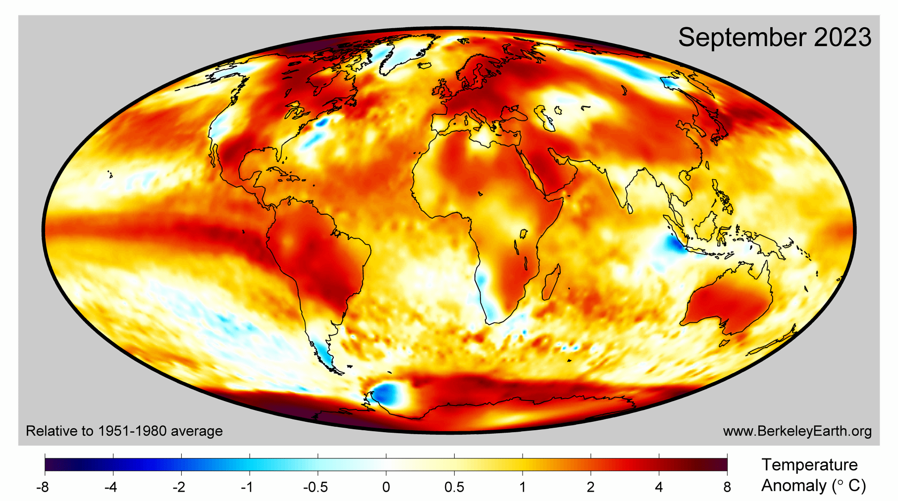
The previous record for warmest September was broken by 0.5°C (0.9°F) (!!)
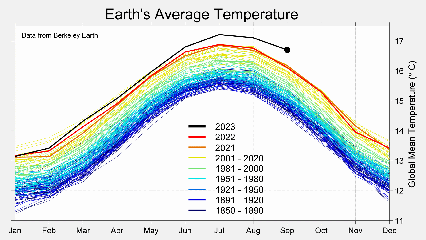
When will people realize the graphs are going exponential?
The previous record for warmest September was broken by 0.5°C (0.9°F) (!!)
When will people realize the graphs are going exponential?
This would be quite a fun graph, if it weren’t so serious:
Happy pride graph! All the economists see the numbers going up so they think it’s really good
The thumbnail looks like a good lasagna.