It’s the first change to the Office default font in more than 15 years.
It’s the first change to the Office default font in more than 15 years.
Man, I remember the change to Calibri, and now I feel really old.
Me too but it just makes me feel nerdy for knowing.
And that’s a good thing.
It felt so fresh and clean at the time too.
Maybe that’s because I learned to type with word perfect 5.1 though.
Back in my day, the big font change was ega to vga.
The US State Department only just directed its employees to use Calibri for memos earlier this year. The State Department had been using Times New Roman instead since 2004. Given it’s taken them the full 16 years to switch over to Calibri, they’ll probably be waiting another decade or more to eventually switch to Aptos.
The shade lmao
USN just made the switch from courier new to TNR. We’re so behind haha!
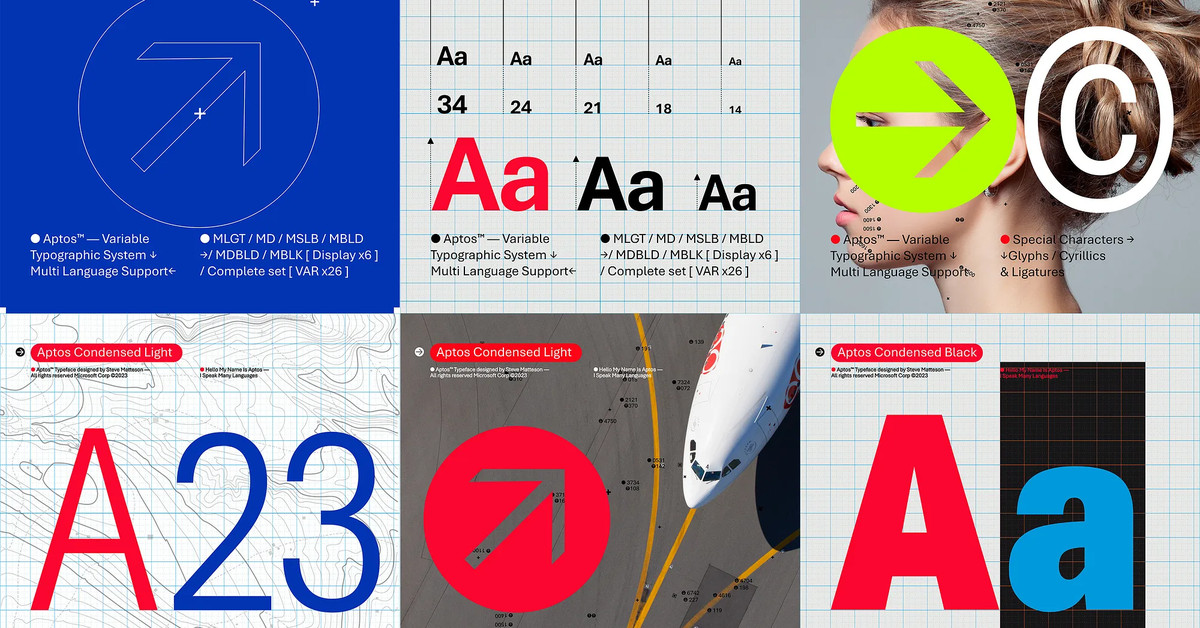
It used to be called Bierstadt, for those who know that name and similar alternatives like Grandview, and the other contenders for next new font. I don’t remember exactly how it looked, but I hope it’s one of the ones where a capital I and a lowercase L look different from each other.
I used to like sans serif until I realized that serif fonts make text more readable and lead to less confusion. For instance, the L / I example earlier, and 0 (Zero) and O (Oh).
We could have had “beer city” instead?
They should have stuck to calling it Bierstadt. It literally means “beer city”/“beer town”, in German. It’s even spelled correctly.
😁Just had a look at these in Word. Aptos looks nice. I personally prefer Tenorite though.