- cross-posted to:
- [email protected]
- [email protected]
- cross-posted to:
- [email protected]
- [email protected]
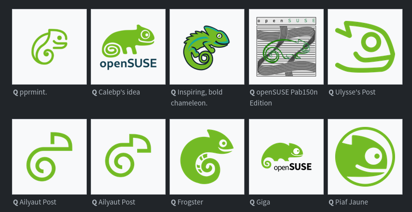
The openSUSE community’s logo contest submission phase is now complete and voting for the logos has begun.
This competition marks a pivotal moment for openSUSE and the voting goes until Dec. 10.
Before making any selections, people are encouraged to visit en.opensuse.org/Logocontest and view the logos before voting.
The number of submissions speaks volumes about the community’s enthusiasm and engagement with 18 submissions for Kalpa, 24 submissions for Slowroll, 21 submissions for Leap, 32 submissions for Tumbleweed and an impressive 36 submissions for a potential new openSUSE logo.


Bottom row, 2nd from the left. Simple, clean, distinct.
Agreed, it really stands apart from all the rest.
Even from the one right next to it that looks almost identical??
Especially that one.
These are two variations from the same artist.
Aliyaut’s logo? It is clean, but it’s hardly even identifiable as a gecko. It blends in too much with all the modern corporate logos we have today IMHO. It’s not a bad choice if they decide to go with it, but they could do better.
Does the order get shuffled each time?
Ailyaut must be a debian fan :)
No
In the thumbnail?
Ah yes, green Debian
I like it for its simplicity but it’s totally lacking character.