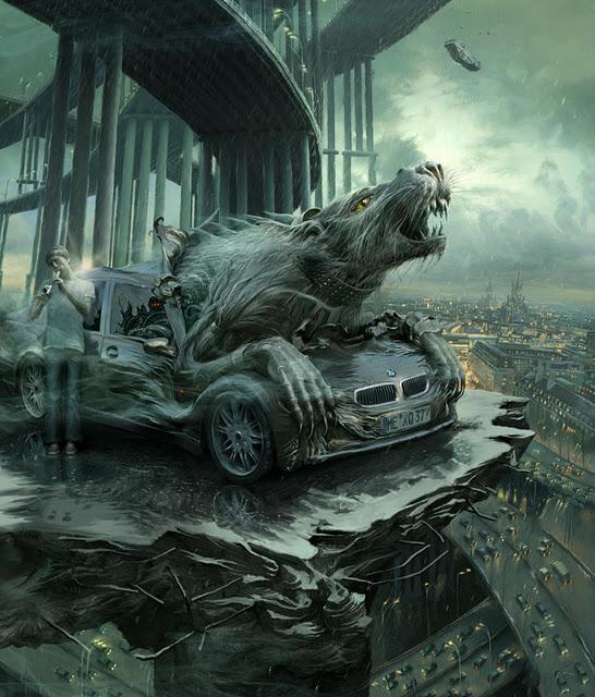
It’s like he spent a lot of time, 1 inch at a time, so none of the pieces quite fit when he gets to another part.
This seems reasonable. Looking at this other work of his it definitely has that sense individual elements individually rendered decently (probably sketched with a reference image) but slightly off when they come together.
(The angle of the overpass compared to the broken platform, the rear tyres of the car at a different angle to the feet of the man looking like it’s floating, the highway below passing under the bridge and just not continuing, the hood of the car extending beyond where the front windscreen would be based on where the rat’s left arm is placed)
I’m not an artist so I feel a bit rich ripping into the work like this. He’s definitely competent and far better than I’ll ever be, but having been made more aware of these ‘continuity/logic errors’ prevalent in generated art does put me, for one, on the lookout to scrutinise human art at a level I wouldn’t have previously. A decade ago I’d probably just go ‘damn cool train’ and be on my way.
This seems reasonable. Looking at this other work of his it definitely has that sense individual elements individually rendered decently (probably sketched with a reference image) but slightly off when they come together.
(The angle of the overpass compared to the broken platform, the rear tyres of the car at a different angle to the feet of the man looking like it’s floating, the highway below passing under the bridge and just not continuing, the hood of the car extending beyond where the front windscreen would be based on where the rat’s left arm is placed)
I’m not an artist so I feel a bit rich ripping into the work like this. He’s definitely competent and far better than I’ll ever be, but having been made more aware of these ‘continuity/logic errors’ prevalent in generated art does put me, for one, on the lookout to scrutinise human art at a level I wouldn’t have previously. A decade ago I’d probably just go ‘damn cool train’ and be on my way.