
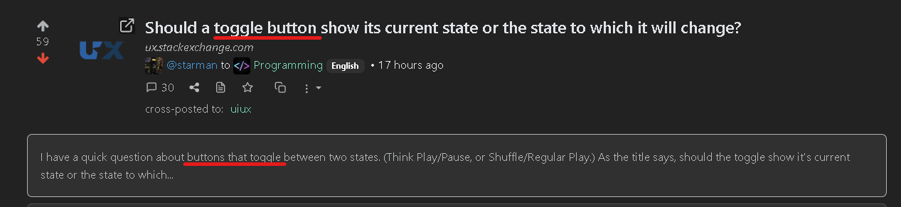
- cross-posted to:
- uiux
It should show the current state, just like a checkbox shows if its option is enabled, an input box its current value etc. Everything else doesn’t make sense.
Exactly. A light switch* shows its current state, and toggle buttons are effectively an equivalent to that.
*Standard, two-way garden variety light switch
I’d argue that a light switch has an indicator that shows the current state, separate from the switch.
Not if the globe has blown out, in which case you need the switch to indicate which state it is in (unless you like to live dangerously and change globes in lights that may be still on :-) ).
Light switches are a bad example. Up doesn’t mean on and down doesn’t mean off when you have multiple switches for the same thing.
These switches visibly have 2 states and switching it means you want the other one. In tech it’s less obvious that there are only two states and that toggling the button will do something in particular. Recall the play and pause button on your media app. That button could change the state in any number of ways but in order to convey to the user what will happen BEFORE the button is pressed, the player shows what action will take place.
You’re already in the current state, that rarely adds info. Toggles should indicate what they will do.
When I think “toggle” switch, I think in terms of binary states: on or off. Which is why I used a light switch as an example rather than a media play/pause button which can have multiple states. In that scenario, yes, it would be more intuitive for the button to display the action it will perform.
Up doesn’t mean on and down doesn’t mean off when you have multiple switches for the same thing.

In my experience only kinda, and by convention (up is on), and three-way switches break this (indicator becomes the light itself).
That’s not the convention in my country. Up is off here. And no switches have labels either.
Without seeing an example I would’ve said a button (actual button, not a checkbox or slider) should show the future state. If a button says “Cancel” I would expect the state to go from a pending state to a cancelled state. Same with a button that says “Submit”. So if it’s some kind of toggle, like play/pause, I would think hitting ⏸️ means I’m currently playing and I want to pause.
Buttons don’t show what is currently happening, but what action, with the provided user input via toggles, input boxes, checkboxes if any, should be taken. In your example, your Cancel Button should Cancel the transaction.
@BrianTheeBiscuiteer @DmMacniel
I see now there’s some confusion. When it said “toggle button”, I thought a Switch was being discussed, but when I clicked on the OP I see it actually does mean button, so we’ve got some people talking about switches and some people talking about buttons (and yeah, a switch should show current state, but a button should show what would happen if you clicked it).
This would be correct if the post was about switches (which TBF many people made that mistake, including me initially), but it’s about buttons - buttons should show what action will result from clicking on them. e.g. “Cancel” on a button which is going to cancel your process. For a play/pause button it should show play if you’re paused (if I click on this it will start playing) and pause if you’re playing (if I click on this it will pause).
oh yeah true, I was thinking of toggle buttons instead of buttons that keep their state/don’t release: like the formatting buttons (bold, italic, underline, …) in a word processor. The latter strangely are also named ToggleButtons so that’s a big confusion.
Yeah, the wording isn’t clear, and some people are talking about switches and some people are talking about buttons. I work with MAUI, and in MAUI a “ToggleButton” is called a Switch, so there’s no confusion there, but the OP specifically said a button which toggles. i.e. a button which has 2 states instead of just one. A play button which turns into a pause button when you press it and vice-versa. I think the OP may have been confused between switches and buttons themselves - which are indeed labelled in opposite ways to each other (switch - current state, button - state that it will cause to happen when pressed) - which led to the question.
Toggles should not exist. They should be check boxes. Checked if “ON”, unchecked if “OFF” with a mouse over tooltip if there is any chance that it’s ambiguous.
@calcopiritus @starman
Buttons/switches trigger an immediate action, whereas checkboxes usually do not (such as on a settings page, where no changes are applied unless you click “save”).
Never said nothing about a button. Toggles are just check boxes with a different aspect.
EDIT: the thread is actually about actual buttons. Maybe should’ve clicked on the link where it explains what he means by “toggle button”.
This whole thread is about buttons
Toggle buttons are not normal buttons, they are toggles. Which have the same functionality as check boxes. They are a toggle between 2 states. The only difference is visual.
If they toggle more than 2 states, (like a discrete slider), it is the same as a drop-down menu.
Some widgets are the exact same as others, where the only difference is their visual representation.
Again you’re talking about switches. The thread is about normal buttons which have 2 states (the example being given is a button which can be a play button or a pause button depending on the current state). Buttons aren’t like check-boxes, switches are. A button triggers an event, check-boxes don’t. e.g. on a settings page, you tick all the check-boxes you want first, then click on the Save (or Cancel) changes button - one event for multiple changes. You don’t tick a check-box to start playing something, you press a play button (which in this case would then change into a pause button).
Yeah you’re right. Didn’t see it was a crosspost and infered from the title.
That’s ok. Thanks for being big enough to admit you were wrong - these days a lot of people aren’t!
In my opinion, any button in terms of graphical UI design simply dispatches an action with no arguments regarding state. There doesn’t exist a dichotomy between a “toggle” mechanic and a “standard” button as far as the button itself is concerned.
Whether or not you want to update the visual representation of that button is a separate concern.
The case that undermines your point is icon toggles, since they don’t need a label, but a checkbox does. For example, dark mode icon buttons: They usually show sun or moon icons, which hits OP’s point: if your in dark mode, and the button shows a moon, that would make sense – except the button doesn’t put you into dark mode, at that point it puts you into light mode, so, shouldn’t it show the sun?
deleted by creator
In the specific case of a dark mode, it doesn’t matter since the whole aspect of the app changes. You could not label the individual states and it’d be fine.
Also, as soon as you add another theme it does no longer work, for a theme selector you need a drop-down selector which lists all the themes.
That’s true, you can’t really miss what’s happening with a dark mode switch – it’s not like it’s a “charge me $50 extra for insurance on my shredded wheat” button.
The theme selector tho – while rare – IDK, that doesn’t have have text – it probably should, for the same if a11y, but you can indicate the theme with an image; the one I made for a project recently uses the image itself on the button.
I agree with the accepted answer that a toggle button UI – when unadorned with any other indicators – should be avoided due to the ambiguity. The fact that this question is being asked is an indicator of non-uniform consensus.
In American English, the verb “to table” means “to remove from discussion entirely”, which is almost entirely the opposite meaning from English spoken anywhere else in the world, where it means “to bring forward for discussion”. As a result of this US-specific confusion, there’s not much choice besides either clarifying through context or avoiding sentence constructions using that verb, at least when speaking to or with other Americans.
I think the same applies here: the small UI space savings is not worth the inevitable UX confusion this would cause, without modifications.
“Sanction” is another great contranym. As far as I know, the meaning doesn’t even depend on dialect, just context.
There are a few words that are their own antonyms. You would think any at all would be too many…
My rule is if it’s a Verb, then what it will do: “Enable”, “Join/Leave”, “Turn on/off”, “Play/Pause”
If it’s an adjective, noun or description of a state, then the condition is what is written. ON/OFF, Enabled, Joined/Left, “Repeating 1/Repeating ALL/Repeat OFF”
Shuffle/Random Play is ambiguous, but it’s either Shuffle ON, Shuffle OFF like the second category, or Shuffle/Unshuffle as the first category.
E: Added the media player example from the original thread.
If it’s a verb it should be a button, not a toggle
Depends on what the purpose of the button is.
A setting should show the current state, but an action (referring to the play button example) should show the state it’ll transition to.
I disagree. I think both the current state and the state it will change to should be clearly labeled.
Also - just because everyone is familiar with something doesn’t make it a good user experience. We’re used to play/pause but it’s honestly not very good.
I don’t know what a great one is but I have an example of a terrible one:
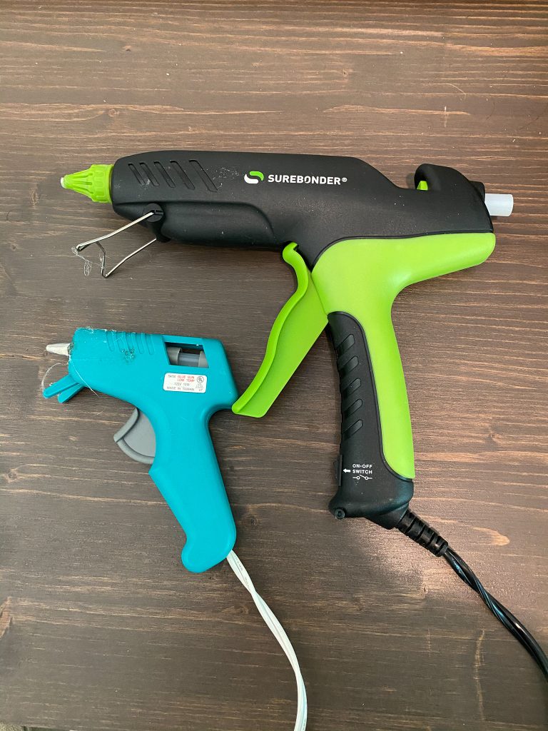
the green/black glue gun has the worst on/off switch I’ve ever encountered.
You can’t see it in the picture, but the actual switch that arrow is pointing to has no text on or around it, so you’re left to pick up or down, plug it in, and wait a few minutes see if you were right.
Wow that’s terrible design
I’ve always wanted a power switch on my hot glue gun but after seeing that, I think I’m now perfectly fine with the existing situation, lest I monkey’s paw my way to an even worse implementation.
to be fair, it’s a great glue gun, and the newer designs have fixed this issue by adding an indicator light.
Typically such a switch would have a ridge on the “on” side to remove that confusion, if they didn’t label it outright. Pity if they neglected that too.
Or a different “feel” when turned on vs. off (more resistance or something). They spent effort printing all that text to show where the switch was when a universal 0/1 would have made it clear.
I can’t think of any example of a button or switch that by itself can be clear if it is engaged or not. A button could be assumed to be on if in, but that isn’t always the case, like for example with emergency stops.
I can’t think of any example of a button or switch that by itself can be clear if it is engaged or not
The power button on my PC lights up when it is on. I have a start/cancel processing button with which I use different colour-schemes - it’s a blue or green button/text for “start processing” and a red button/text for “cancel processing” (i.e. danger - this has consequences if you press it!).
Knowing how a switch works in a circuit and how it’s typically represented in schematics, I would guess that moving the switch toward the body of the gun should be off.
But if actually placing a bet, I’d put my money on it being the other way.
I carved “On” into mine, it’s exactly opposite of what you described.
Personal opinion, but it should show a single state and if it is active.
Why is this 13 year old stack overflow question being reposted
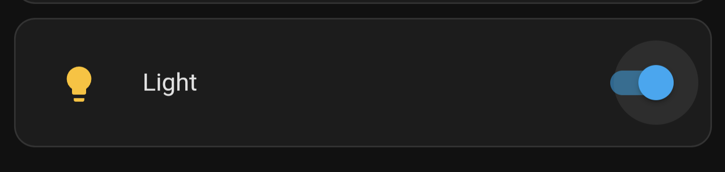
Weird, but I found it a super interesting read. It made me think of Home Assistant as one of the only software that I could think of that uses a toggle button from the top of my head. I think it handles these states wonderfully.
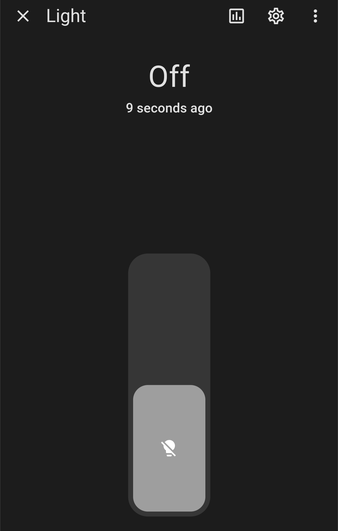


Edit: The big one I rarely see. But, either one seems quite intuitive.
That’s fair, I use toggles somewhat regularly in web dev and semantic ui has nice styling for them. Not as fancy as home assistant though, those are very clear!
Right?!? I find their design to be some of the best I’ve seen. Even against proprietary software.
Didn’t you get the memo? We’re doing away with privately-owned platforms and starting fresh in the Fediverse :-)

Neither. A button should show action it performs.


