

Ive been working on some unified icons for the instance so the icons feel like they belong together
Let me know if you like them or if there’s some adjustments I should make
Some examples from ones I’ve done
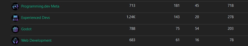

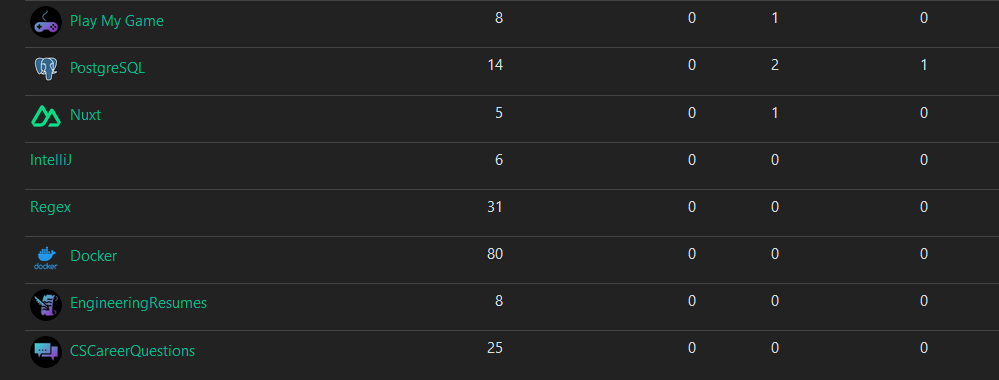
The majority of them are generated from https://game-icons.net/ with the settings of foreground being shrunk twice and position being x:2 y:2. Foreground color is diagonal from 2EE5D2 to A01FC5. And has a shadow with color 423025 and blur set to 15. The background color is just black
I think we could also help some mods to find project artwork or logos that are textless, increasing their relative size for easier visual recognition. E.g.
Textless:
Of course some icons are unavoidably text, like php, R, C/C++, etc.
But their also common enough to ID on sight given additional color cues.
Java coffee? No way, we should use Duke!
I’m actually fine either way, I just have a soft spot for weird mascots, like the 1996 Olympics mascot Izzy.
I guess it was officially “open sourced” under a BSD license, but I still mentally associate that mascot with 💰 Oracle: