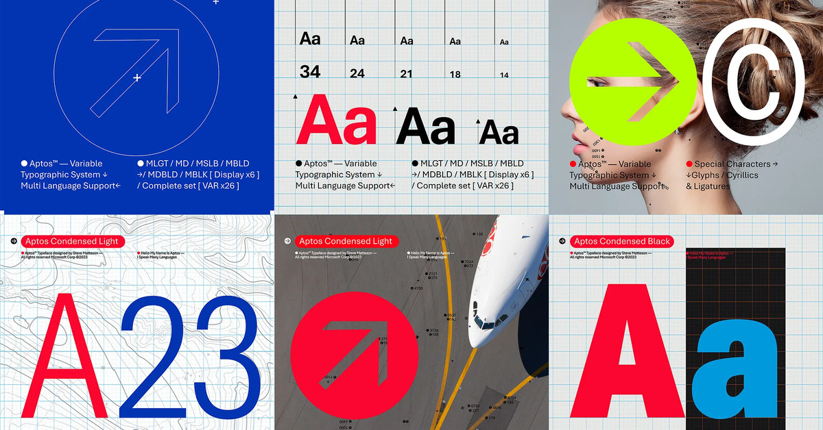
The update hasn’t happened for me yet, so we’ve still got some time to get used to Bierstadt a.k.a. Aptos. It has a curve at the bottom of the lower-case l like DejaVu Sans Mono and Cascadia Code, but without the top serif.
Agreed that it’s wider at the same point size. Not sure if it’s easier or harder to read yet, especially that “a”. Seems a little heavier to counter display technology that makes old fonts so thin (and maybe superthin fonts falling out of fashion?). Probably blends better with Chinese, Japanese, and Korean due to being squarer and having shorter descenders, but I don’t trust my eye.


The update hasn’t happened for me yet, so we’ve still got some time to get used to Bierstadt a.k.a. Aptos. It has a curve at the bottom of the lower-case l like DejaVu Sans Mono and Cascadia Code, but without the top serif.
It also takes up more horizontal space than Calibri. I don’t think I like it.
Top is Calibri, bottom is Bierstadt:
Agreed that it’s wider at the same point size. Not sure if it’s easier or harder to read yet, especially that “a”. Seems a little heavier to counter display technology that makes old fonts so thin (and maybe superthin fonts falling out of fashion?). Probably blends better with Chinese, Japanese, and Korean due to being squarer and having shorter descenders, but I don’t trust my eye.