- cross-posted to:
- [email protected]
- programming
- programming

- cross-posted to:
- [email protected]
- programming
- programming
You must log in or register to comment.
Interesting topic, but I can’t read it as it is. If any of the authors of the article (or the person who is responsible for the design and styling) reads my comment, please don’t do full white text on full black background. My eyes burns from reading longer text like this. There are many ways to style with dark background, but not like this. Black text on white background is so much better.
Not end of the world, I can just disable the page styling in Firefox: View > Page Style > No Style
Yeah! What he said!
I’ve been using https://darkreader.org/ with settings to make the text an orangey-yellow with a black background. I don’t know what most websites are intended to look like by the authors. I really like the extension. I’m not sure if there’s a way to make it do the reverse for you, but might be worth looking into.
Firefox has a reader view mode, which I can enable by clicking an icon in the address bar. But for some reason, this icon will not appear for this website here. I even have enabled a setting in the about:config that this icon should be shown for all pages, but it will not for this site.
I used darkreader in the past. But I could not find a solution to just enable temporarily for the current page I am reading. I don’t want to enable for all pages. But you actually reminded me of another plugin I totally forgot: Tranquility Reader https://addons.mozilla.org/en-US/firefox/addon/tranquility-1/ and it does exactly what I want and works for this page too. A click will turn it into a readable text temporarily (default black on white, but changeable). So I guess this is a solved problem for me now? Thanks to you, because otherwise I would not remember and lookup again.
Awesome! I installed that Tranquility plugin too for those times when reader view in Firefox doesn’t work, which I’ve been annoyed with but never looked for a solution. Now I have that solution!
Fascinating! White-on-black is how I’ve used ereaders for around 15 years now. Black-on-white (on a screen) burns my eyes.
Did you spend much time as a kid with a raw terminal (eg vanilla DOS on a CRT)? I’m curious if anecdotally there is correlation.
I have an Ebook reader too (but very old, with slow page building, didn’t use in years) and it’s much different from a regular screen. Also much smaller too. So I can’t compare it to that. My monitor is high resolution, has much more dynamic range than a ereader and is much brighter too. And bigger.
I didn’t have a computer as a kid (90s) and didn’t use DOS or anything, even though i used computers here and there back then. So I don’t think its related to that theory of using too much raw terminal. In fact, I do program or play with commandline tools almost every day or a few days apart a little bit (mostly scripting or trying things out for hobby) in the terminal and I use dark color schemes since years. For programming it is much better to me. But I am very selective until I find a “usable” color scheme. My favorite so far is Gruvbox theme https://github.com/morhetz/gruvbox, but I use something different at the moment. In fact I have set beehaw.org site to dark theme too:

But pure white on black on a monitor just hurts my eyes, when there is lot of text to read.
Absolutely (re: theming and tuning)! My actual work scheme is a slightly off white and a lighter transparent black, which is closer to the theming you’re talking about. I’m also just really happy with simple stuff, possibly because I did have that old CRT experience? Your point about size is well-taken. I read this article on my phone (which is my travel ereader) and wasn’t bothered. I hadn’t considered size there.
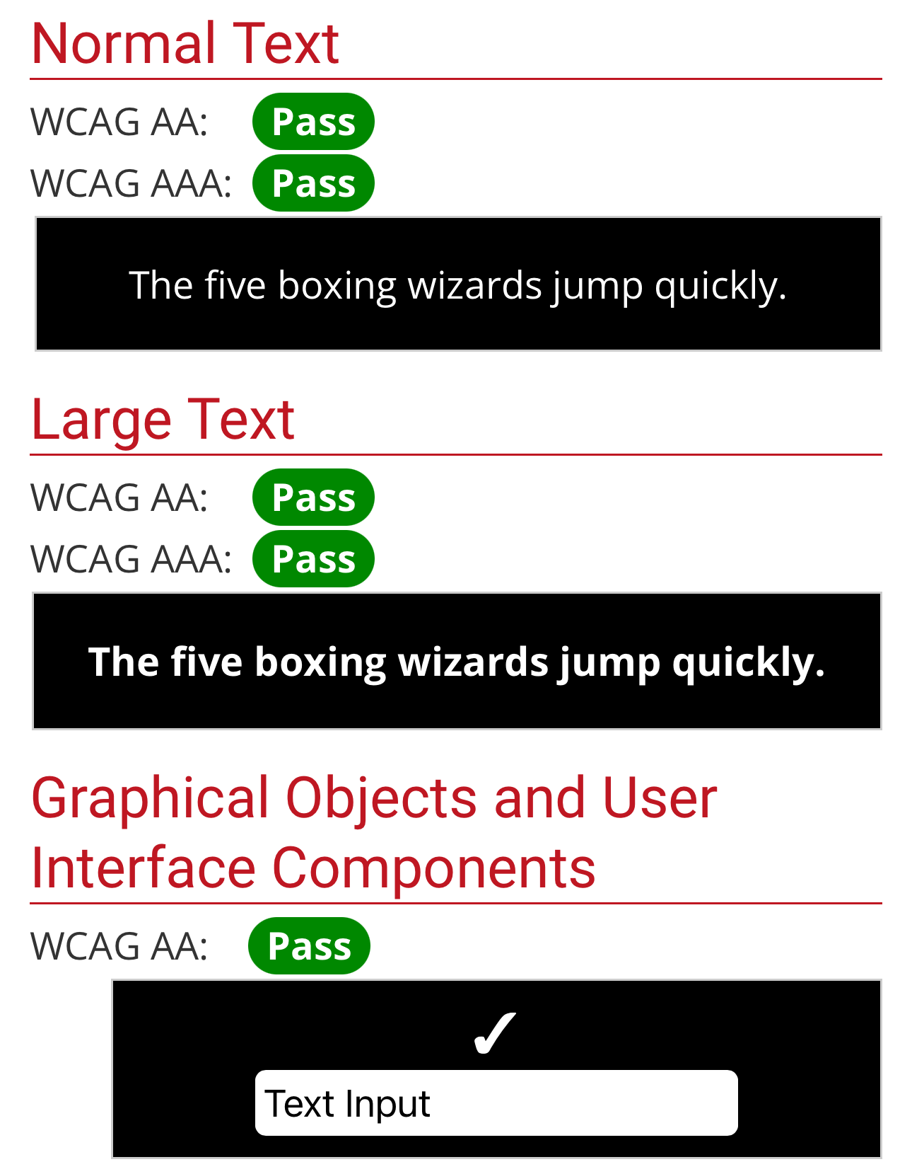
The tools linked in the article (eg WebAIM)you linked give white on black a pass.
The Philosophy section has quite a few wonky arguments; I’d skip it altogether.
Guidelines is pretty succinct and has many rules-of-thumb that almost any software would benefit from. That’s including CLI, GUI, libraries – even hardware if you take a bit of a step back.
The Philosophy section has quite a few wonky arguments; I’d skip it altogether.
I agree. I wish they moved that to a standalone section so that it could be easily skipable. Reference docs can and should have a rationale, but a lengthy rant is not what leads people to the site.
That’s way too much text. It’s an interesting topic but I can’t imagine anyone is going to read that essay. Can’t it be condensed down to a few simple examples?