

- cross-posted to:
- [email protected]
- cross-posted to:
- [email protected]
You must log in or register to comment.
All those countries are in-continent.
Except for the one with Europe. It’s semi-continent in-continent
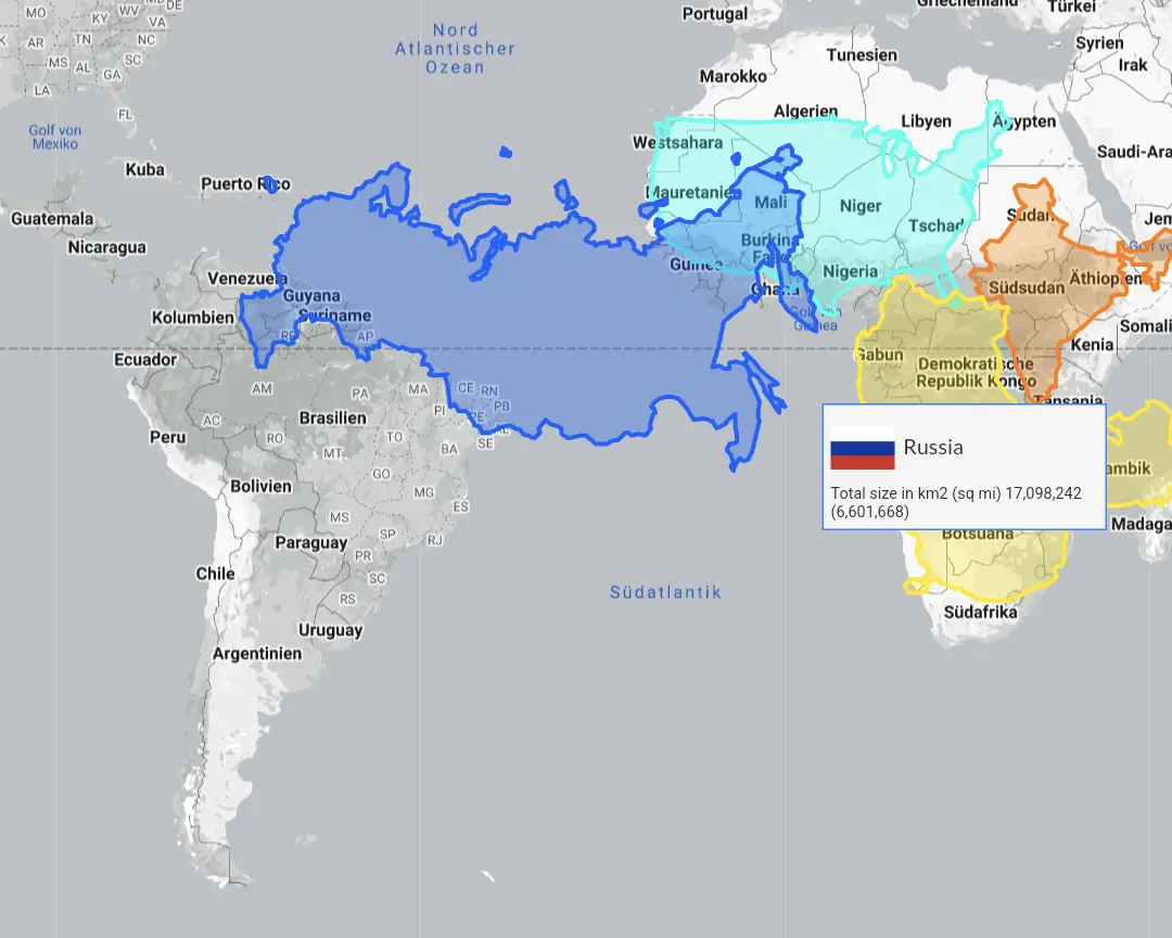
www.thetruesize.com is a fun interactive website for seeing how Mercator maps lie.
What’s your preferred projection?
To say that Mercator “lies” is to misrepresent the complications of projecting a 3 dimensional object onto a 2 dimensional surface. All projections “lie” in this sense because they’re simplifications of reality - that’s what a map is.
this video is based on the comic: it’s an animation on how each projection would change when shifted.
A globe, Apple Maps, or Google Earth
Yes, you’re very clever.
This isn’t an answer, it’s a dodge.
Mercator is the most accessible paper map. The Authagraph is the most accurate due to low distortion. It’s not listed in the comic, and can be confusing to use as a learning tool.
The real question is why are you so committed to flat maps in the digital age? I don’t even understand why Google Maps doesn’t correct to a spheroid when zoomed out like Apple Maps, requiring users to download Google Earth for accurate representation of land mass size comparison.
I think the contiguous US like in the picture is more like 8m km² isn’t it? 9.8 must be counting Alaska, Hawaii and maybe the territories.
I don’t like that Russia looks like they just took a Mercator projection and shrank to scale. Because of its shape and location, Russia is especially distorted by the Equatorial-centred Mercator.
Also what’s with the “excluding Russia” footnote?
Europe without the part of russia that lies on the continent.
But true, Russia at the equator looks like this:
A galloping sheep.
Ah, I see. It’s
Europe *
As opposed to the False Size of Africa
Literally what the Mercator projection is
I mean, it’s a continent


