Test your knowledge of blue vs green.
This will depend on what people’s screen looks like. Some screens are more yellow tinted while some are more blue tinted.
Also the middle ranges i would not categorize as either blue or green, i call them blue-green or teal or some other name.
I think that is the main point of the site, to see differences in color on different screens devices. It doesn’t actually say that, though. It is more about when two people argue about a shade of blue or green like turquoise or teal, I think. I just put to test knowledge but I was thinking what word to use that would be like color recognition or the differences between how we interpret color etc. idk.
The “About” section (which is only available after completing the test) says the following:
About This Website
People have different names for the colors they see. Language can affect how we memorize and name colors. This is a color naming test designed to measure your personal blue-green boundary.
Test validity
Color perception is tricky to measure–vision scientists use specialized calibrated equipment to measure color perception. Graphic designers use physical color cards, such as those made by Pantone, so that they can communicate colors unambiguously. Here we use your monitor or phone to test how you categorize colors, which is far from perfect, since your calibration may differ from mine.
The validity of the inference is limited by the calibration of your monitor, ambient lighting, and filters such as night mode. Despite these limitations, the results should have good test-retest reliability on the same device, in the same ambient light, which you can verify by taking the test multiple times. If you want to compare your results with friends, use the same device in the same ambient light.
Getting outlier results doesn’t mean there’s anything wrong with your vision. It might mean you have an idiosyncratic way of naming colors, or that your monitor and lighting is unusual.
Technical Details
The test asks you to categorize colors sequentially. Colors are often represented in HSL (hue, saturation, lightness) color space. Hue 120 is green, and hue 240 is blue. The test focuses on blue-green hues between 150 and 210. On the web, HSL coordinates are translated to sRGB color space, the standard color space of the web, which is not perceptually uniform. These sRGB values are translated nonlinearly to your monitor through a gamma curve.
The test assumes that your responses between blue and green are represented by a sigmoid curve. It sequentially fits that sigmoid curve to your responses:

This is equivalent to a logistic regression model. The test uses a maximum-a-posteriori (MAP) estimation algorithm (specifically, a second order Newton method implemented in pure JS, no calls to a backend) to fit the sigmoid curve to your responses, with a vague prior on the scale and offset parameters. It uses the fitted curve to determine which color will be presented next. It tries to be smart about where it samples new points, focusing on regions where you’re predicted to be intermediately confident in your responses. To improve the validity of the results, it randomizes which points it samples, and uses a noise mask to mitigate visual adaptation.
It’s a curve fit, not a binary search. In theory, if you feel like you’re guessing in the middle shades, or even guessing incorrectly, that should be fine. If you’re inconsistent in the middle, the curve fit should be able to recover, although your estimated threshold will have larger error bars.
Results
In early experiments, we found that people’s responses cluster around 175, which coincidentally is the same as the named HTML color turquoise . This is interesting, because the nominal boundary between blue and green is at 180, the named HTML color cyan . That means most people’s boundaries are shifted toward saying that cyan is blue.
What information does this website collect?
This website collects aggregate usage metrics to understand how many people use the site and when. Since we received plenty of responses to the test, we have closed data submission.
Who made this?
I’m Patrick Mineault, a neuroscience and AI researcher. I made this as a side project using Claude 3.5 Sonnet. I obtained a PhD in visual neuroscience from McGill in 2014. You can read my blog here.
Can I make a version of this for my favorite color pair?
Right this way to Github.
Well I was close. I thought it was a variation of one of those tetrachromat tests but. to see if you can distinguish blue and green but it seems to be way deeper
Still holds value for comparison’s sake if multiple people take the test on the same device.
Turquoise is blue.
To you. I think that’s what the whole test is about.
🌊🌊🩵💙🩵💧💧💧💙🩵💙🌊🌊
I propose this website is a message from God, and we should form sects intended to destroy the unholy turquoise is green menace! We must purge them from this land!
Only God’s BLUE TRUTH must prevail! TURQUOISE IS BLUE!!! ALWAYS WAS BLUE!!! AND FOREVER SHALL BE BLUE!!!
Your words sound like that of a wrong-believer! Of a green! Confess the greeness of your sins or face a holy bluing you may not survive!
🌊🌊🩵💙🩵💧💧💧💙🩵💙🌊🌊

Didn’t realise it was also a D&D and Political alignment test
Dang, true neutral. I kept getting opposite results
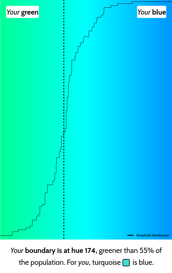
i literally also got exactly 174.
I’m also 174, but just on the left side of the median somehow. Also I’m colourblind but weak to red so this didn’t really affect me I guess.

What screen you used when testing?
I took it on my Acer XV275K P3, which is supposedly factory calibrated to: a white balance of 7,500K, average Delta E of 1.54 (Green x of .21, y .71, Blue x .15, y .04), and 99.8% sRBG coverage. Using NixOS Unstable (rev 970e93b9f82e2a0f3675757eb0bfc73297cc6370) with KDE Plasma 6.2.4 in Wayland with HDR enabled, with SDR brightness at 50 nits, SDR saturation at +30%, and screen brightness at 80%. Firefox 133.0 64-bit running in native Wayland mode. I also got hue 174 true neutral, but there one or two where I could’ve chosen either way so idk.
I got it on iPhone 15 pro no idea the numbers
Hmm. The second color I got was pretty much exactly cyan, and no option to choose that. I don’t like this color erasure!
But was it closer to blue or green
Nearly exactly centered according to both me and HTML it seems (based on the about box info)

It’s about perception. Using the HTML value defeats the purpose. 00FFFF probably isn’t necessarily right in the middle of your perception, despite being halfway green and blue pixels. (Your display will also obviously effect this, and maybe your green or blue pixels are stronger than average, or balanced differently.)
Those are my actual test results - I perceived that as the middle, then afterwards found out how close it was to the numeric middle.
For you, Teal is Green.
Uhhh…no. For me, Teal is Teal. But that wasn’t one of the options…
This was very interesting, thanks. I’ve read somewhere that some cultures don’t differentiate between blue and green, and actually have one word that covers shades of both.
I’ve heard that early languages also call red and orange fruits the same color or something but I couldn’t find the source.
Pink was also covered by red. I believe the name for pink comes from the plant group Dianthus, which includes carnations. They were a popular adorment worn by men on their suits at weddings for a period of time, during which probably made the colour reference familiar to most people and then became the norm (Hopefully that’s all correct, that’s what I understand at least!).
There also exist ‘pinking scissors’ for cutting those trianglar jagged edges to fabrics. The term ‘pinking’ refering to the Dianthus flower petals that have a jagged edge.
So pink was a shape rather than a colour originally!
Yeah, I think orange is a relatively new “color”
Yes, the color is named after the fruit, not the other way around!
In Japanese you call a traffic light’s green blue instead, and early fruit or immature people are called blue or bluish.
Also, Spanish and Portuguese got their “blue” word from Arabic: Azul, which in reality it would be closer to Azure than blue, but that’s because it came from lapis lazuli-made dyes for ceramics.
~Note: I might misremembered something from the previous statement, buyers beware.~
Yep, I got it right, originally from Persian lapis lazuli for the dye. Somehow the other Romance languages use a different word for blue but kept a word for the color azure, it could well be that it got introduced through the Iberians.
Thanks for fact-checking!
Knowledgeis a really poor word choice here.Lol, I couldn’t think of what word to use. I wish it had all the colors to compare.
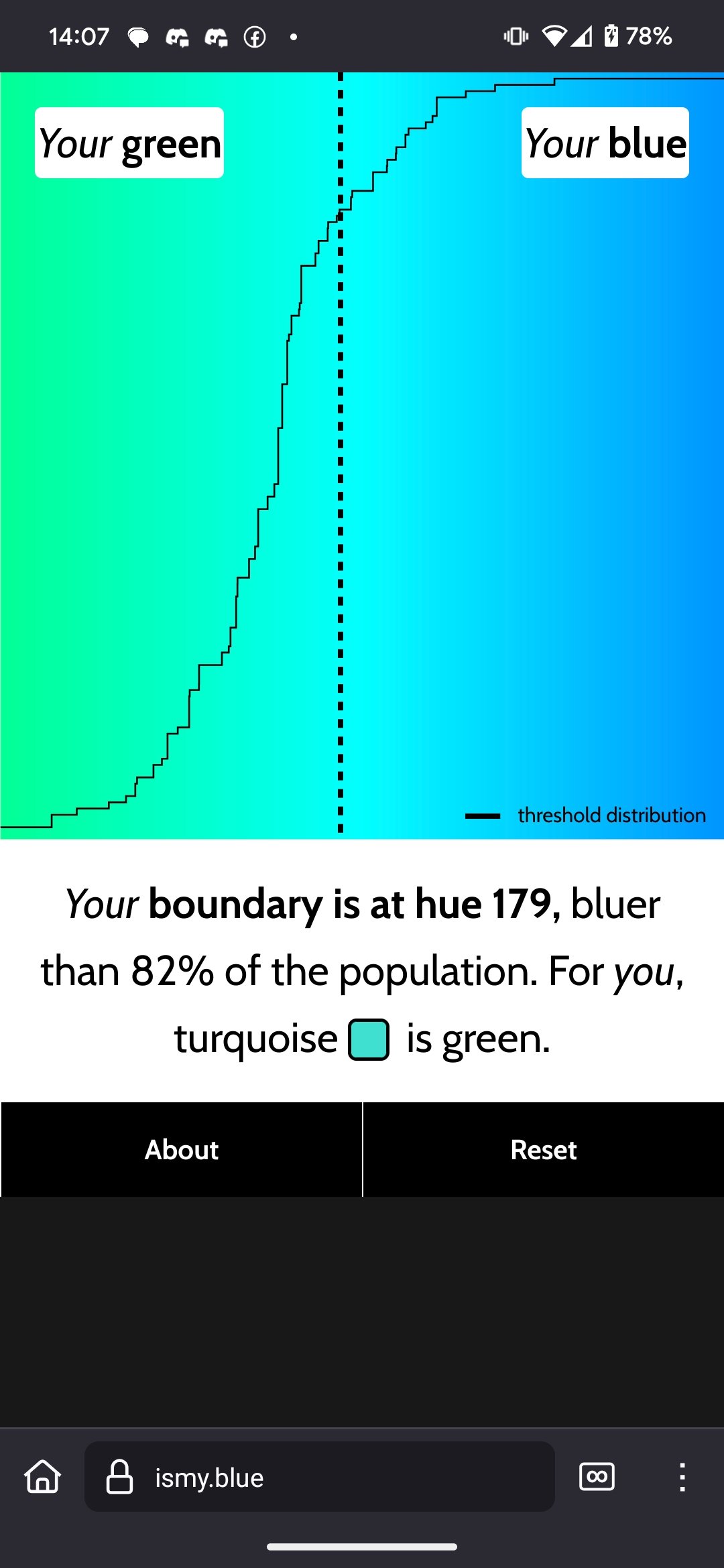
My results.

When I am unsure, I answered “blue”, which I guess swayed my score further into green than it should be.
EDIT: I misspoke.

Rather green
No way!

Twinsies!!
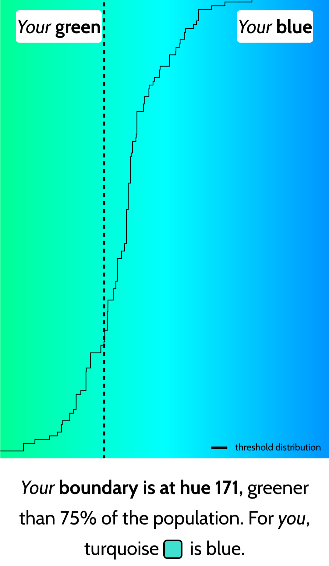
Twins! Except I’m greener than 76%
I was incredibly green. Did it on phone tho with shitty brightness. Maybe it gets better if I turn it up
I ran it thrice, and got the following results:
172
176
175
I ran it twice and got 173 (greener than 57%) and 176 (bluer than 75%).
I’m sure my uncalibrated monitor with a Color Temperature of “Off” helped a lot.
I think my expensive screen is really good because I got a true neutral. Probably too good for any of my needs but it is surprising how it comes out in such random posts from time to time


