Easily one of my favorite features coming in 4.2, I’ve been using it all the time to make things tidy.
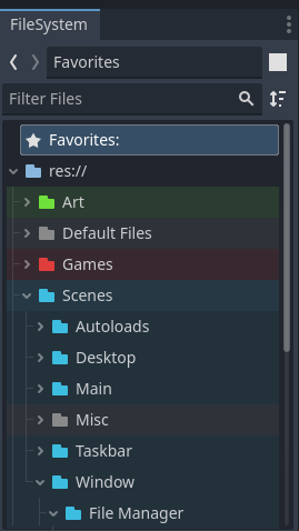
I love this kind of features, that are not that hard to implement but brings you so much.
Me too. This kind of thing is what makes an interface truly great to me. I’m not sure if it would even be called a “qol feature” because it doesn’t necessarily speed things up or automate anything. It just makes the interface more comfy and that goes a long way.
I’d argue that it does speed things up because you can more quickly find the folder you are looking for
When the UI itself is created in the game engine UI, and everyone is allowed to contribute and modify, I guess things like this happen.
Developer intentions: color code directories to help organise your project.
My brain: pride flags in every project! 🏳️🌈
GAYDOT
